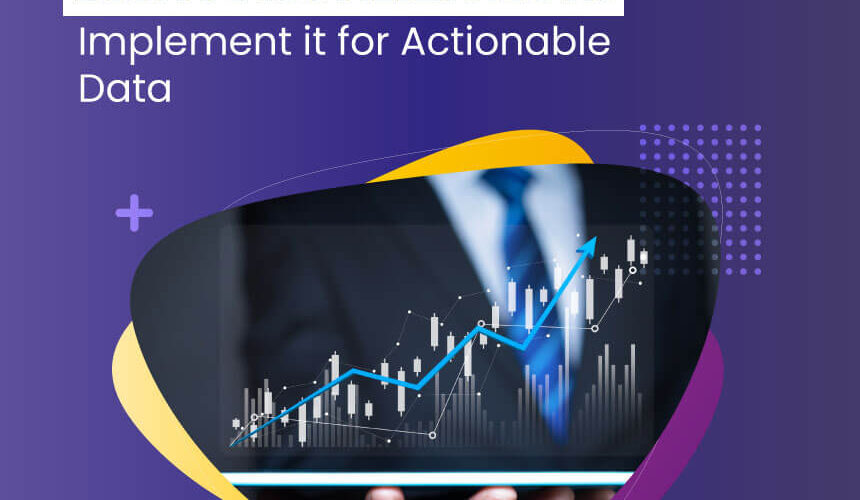
A large amount of data often derives complex results. At the same time, it isn’t easy to communicate these results with the intended people. However, with proper data visualization, data becomes more exciting and easy to analyze, and gain the required insights quickly and deeply.
Data visualization is an enhanced pathway to convey insights more clearly and understandably. At the same time, a wrongly shared visual will not meet the intended results. Hence, lies the need to build a good data visualization strategy that can come up with some informative and relevant images through which the communication happens more interestingly.
Going further, we will know the significance of data visualization and its impact to derive actionable data:
Initially, let us brief about actionable data:
Actionable data gives enough information to the key decision-makers to make effective decisions. Data analytics and processing role is vital to share better actionable data. Customer data is huge, which needs to be analyzed to know their behavioural patterns, interests, habits and any other financial decisions they make.
There are two kinds of data actions. They include direct action and indirect action.
Direct action:
Direct actions lead to prompt actions. Some of them include the following:
Customers list to be contacted through email
Reminder notifications to execute a particular action
Marketing data analysis to implement targeted online campaign
Indirect action:
Indirect actions help people make the right decisions. Its primary activities include work collaboration. Other significant aspects include the following:
Quality: Quality is what matters. Completeness, security, consistency contribute to quality.
Accessibility: Accessibility includes elements such as user proficiency devices and data modalities.
Accuracy: This significant element majorly deals with accurate data elements.
Data visualization’s role for actionable data:
Optimal usage of the data visualization techniques helps turn actionable data more apparent. Its role is vital to trace and turn the hidden key elements accessible. Unstructured data finds a greater momentum with data visualization.
Choosing the most relevant pictures matter when implementing data visualization. Otherwise, they do not serve the purpose well. For instance, a line graph and a pie chart have their distinct ability to portray the information visually. However, using them appropriately matters. Choosing the line graph instead of the pie chart and vice versa would not yield the expected results.
Visuals themselves do not represent the purpose. What matters is the choice behind it when to go with what kind of design depending on the data. What holds importance to build actionable data? The answer lies with choosing data visualization design, taking into account various factors such as data set goals and necessary insights.
The main principles for data visualization include the following:
Clearness:
One information per one visual
The visuals conceptualize the intent
Satisfies simplicity, and the same time the significant information is preserved
Transparency:
A perfect data visualization helps gain insights for lead discussions
The possible assumptions must be put forward so that it brings people together to share their ideas and opinions
Togetherness:
The prominent factor about data visualization is that it can represent any limitations and ambiguity more correctly and genuinely.
Conclusion:
Actionable data is the direct result of good data visualization and proves more advantageous concerning data interpretation. ONPASSIVE is set to improve how businesses work. The AI tools enable business operations to be simple and quick.
For any business, satisfying customers is important than all. How can any business achieve it? It can only be through interpreting the data concerning user operations. AI tools can study user activities more positively. When it comes to data visualization, the results prove outstanding with the AI. Leverage them for best results.
Source link


I used to be able to find good info from your articles.