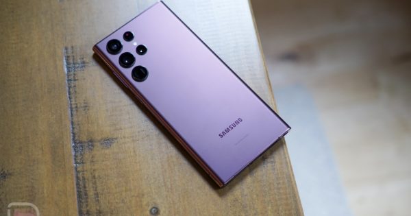
The phone at the top of this post is not the Galaxy S23 Ultra. It’s a Galaxy S22 Ultra. I point that out because a fresh round of Galaxy S23 Ultra renders arrived today and the differences between the two are difficult to point to out.
The images spread everywhere are said to be from official press materials and they certainly look legit. Again, they look like images of the Galaxy S22 Ultra in different colors, but that’s also sort of what we expect from the Galaxy S23 Ultra. Samsung is not doing a big design refresh for the Ultra this year, only for the S23 and S23+ models. And those, as you are well aware, are taking on the design of the Ultra to make the whole series look like it belongs together.
These new S23 Ultra images arrive from Nieuwe Mobiel and can be seen below in a couple of colors. They actually posted all of the expected colors: Phantom Black, Cotton Flower, Botanic Green, and Misty Lilac. I included the Black and Lilac colors here.
So yeah, what should we say about these? The phone looks familiar! That’s a familiar camera design. The buttons are where we know them to be. The roundness to the frame is there. The S Pen is still very much embedded in the bottom of the device. It looks nice enough, if not a tad sleepy.
I’m curious to see how Samsung pushes this and the regular Galaxy S23 models. Selling high-end phones is getting tougher and tougher and these just don’t look like new devices. I know Apple gets away with the same design year after year, but can an Android smartphone maker? What is the pitch? It can’t just be a 200MP camera. It can’t just be 5 years of updates. It can’t be this design. Or is all that enough?
Source link


