

![]()
If you’re not following form design best practices, you’re leaving a lot of money on the table.
While forms aren’t the sexiest part of conversion optimization, they tend to be the closest to the money—the macro-conversions. Spending a little time optimizing forms can be some of the most important optimization work you can do.
Of course, best practices don’t work the same on all sites. It’s contextual. But generally, implementing form design tactics that work more often than not is a good way to get started.
Luckily there’s no shortage of data, case studies, research, and examples on form design best practices. It comes from all over the place: business case studies, blog posts, A/B test examples, usability research, eye-tracking studies, and more.
This post outlines some of the most common form design best practices. If you’re just starting with optimization, use them as a baseline.
If you’re working on your forms, these guidelines should help you get some quick wins.
-
13 Form Design Principles & Best Practices
- 1. Less is more (i.e. remove form fields).
- 2. Single-column beats multi-column forms.
- 3. Communicate errors clearly.
- 4. Use inline form-field validation.
- 5. Order fields from easiest to hardest to fill out.
- 6. Make typing easy.
- 7. Indicate if each field is required or optional (unless they’re all required).
- 8. Name and phone number fields should be one field.
- 9. Offer radio buttons instead of drop-down boxes.
- 10. Don’t make coupon code fields prominent.
- 11. Avoid the “clear fields” button.
- 12. Offer field focus.
- 13. Don’t mask passwords.
- Caveat: Run your own experiments.
- Conclusion
13 Form Design Principles & Best Practices 1. Less is more (i.e. remove form fields).
Every field you ask users to fill out increases friction. The best thing you can do to improve form completions is to get rid of as many fields as possible.
In one case study, an 11-field contact form was replaced with a 4-field version, and form completions increased by 160%. (The quality of submissions stayed the same.)
In another test, a 5-field form outperformed a 9-field form by 34%. In this one, too, there was no drop in data or lead quality.
Most forms are too long. It’s “greedy marketer syndrome”—we think we need all the data.
Baymard Institute found that the average checkout contains 14.88 form fields. But their checkout usability testing also showed that most sites can achieve a 20–60% reduction in the number of form fields displayed by default.
Essentially, the average checkout displays twice as many form fields as needed.

So form-field reduction is ground zero for bottom-of-funnel conversion optimization. It’s where you can get some of your quickest wins. The effort and resources required are super low, and the potential gains are tremendous, especially at scale:
- How many forms do you have?
- How many people experience them?
- What would a 10% increase on each form mean to you?
Now, there are definitely data concerns, especially if you’re a B2B company doing lead generation and passing leads to a sales team. You want to make sure they’re qualified leads; otherwise, more leads become an externality, incurring a cost in wasted productivity.
You can screen leads with, for example, a tiered system of allotted budgets. Basically, how much is the lead willing to pay? Set the lowest bar at the lowest you think a valuable lead would be worth, and you’ll weed out a lot of tire kickers.
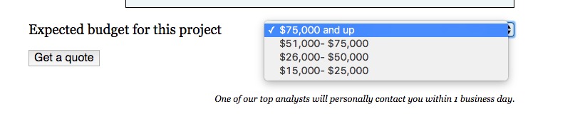
An example from our agency page:
When you’re optimizing form fields, ask about the data: Do you really need it? Do you really need people’s phone, fax, or address? Do you need a company name if you’re selling candles? Ask only what’s relevant. Expedia removed the “Company” field from their booking form and saw an increase of $12 million a year in profit.
Know also that, especially for B2B, data enrichment companies like Clearbit exist. If you collect an email and maybe a first name, they can generally enrich the rest of the data (company name, size, Twitter handle, etc.).
Think about it this way: Every additional fields makes you lose a number of prospects. Is the additional information you gain from the field worth losing those people? Do you lose anything if you don’t get all the data right away?
 Most forms are far too long. (Image Source)
The best sign-up form is short:
 (
(As always, there are exceptions. Reducing form fields doesn’t always increase conversions. Plus, the more information you collect on a user, the more effective marketing and targeting you can use (usually).
In general, though, it’s safe to follow this heuristic: Remove useless or superfluous form fields.
2. Single-column beats multi-column forms.
This has been well researched in eye-tracking studies (including our own), case studies, and A/B tests. When you’re deciding between a single-column or multi-column form design, default to the single column.

In the CXL study, survey participants completed the linear, single-column form (n = 356) an average of 15.4 seconds faster than the multi-column form (n = 346). This was significantly faster at a 95% confidence level.
This guideline isn’t new. In fact, it’s been around for years, but until our study, there wasn’t much quantitative evidence for it. Still, those in conversion optimization will have undoubtedly seen dozens of compelling user tests, as well as A/B tests, that show single columns to be more usable.
I’m sure there are exceptions to this rule (as with any), but I haven’t found anything empirical support.
3. Communicate errors clearly.
Users will make mistakes. It’s inevitable. Even if you use every form design best practice, users will still ring up error messages. How you handle error messages matters.
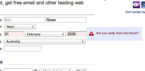
Designing error messages is all about limiting the frustration users feel with your form. When users feel frustrated, they get stressed. Cortisol starts to build up. If it hits a certain threshold, users give up and go to your competitor’s site.
So, yes, do usability research yourself, but start with these error message best practices:
- Don’t blame the user.
- Write like a human, not a robot.
- Make sure errors are clear, and the messages are positioned in an intuitive location.
- Make sure users know how to fix said errors.
- Don’t list all errors at the top of the page. Inline validation is a good solution.
4. Use inline form-field validation.
Also related to error messages is how you communicate to a user whether their submission is okay. Form validation is whole topic of its own, but we can cover some aspects here.
Inline validation is a beautiful way to find, alert, and correct errors in real time. Instead of waiting until users press “submit,” they learn right away what went wrong.
Here’s a great example of inline validation:

There’s a lot of empirical support for inline validation. In 2009, Luke Wroblewski tested inline validation against a control (after-submit validation), and even though the sample was small, he found the following results with the inline version:
- 22% increase in success rates;
- 22% decrease in errors made;
- 31% increase in satisfaction rating;
- 42% decrease in completion times;
- 47% decrease in the number of eye fixations.
I’ll take those results. (I’ve seen similar results from A/B tests run on many ecommerce sites.)
It’s all about clear expectations and communication. A user shouldn’t have to guess what will work and what won’t. The easier you can make it to understand the expectations, the fewer errors people will make and the more form completions you’ll achieve.
5. Order fields from easiest to hardest to fill out.
Robert Cialdini’s principle of “commitment and consistency” states that when someone takes a small action or step toward something, they feel compelled to finish. For this reason, it’s a form design best practice to put the easiest stuff first.
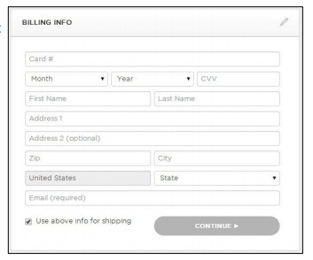
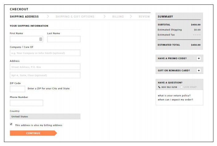
Wait until later to introduce friction (e.g., billing information or anything too personal). Allow people to complete shipping information before billing. (They’re often the same, so they won’t need to type it again.)
Don’t do this:
6. Make typing easy.
The overarching principle for form design best practices keeps popping up: Make things easy for the user (especially for mobile forms).
Limit the amount of typing users need to do to complete a form. One way is to automate as much as possible with features like autofill.

When deciding on autofills, here are some good questions to reflect on:
- Do you have any good defaults for this field?
- What’s the history available?
- Do you have any commonly used values?
- Can you use the browser of mobile features or settings to populate the field?
- Can you calculate the field? (e.g., autofill the state based on the zip code)
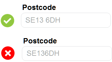
Autoformatting is also incredibly important (and frustratingly underused). Allow users to enter data (particularly fields such as zip code, phone number, and credit card) any way they want. It takes a few lines of code to fix the formatting after they input it. Don’t let your laziness ruin the user experience.
So don’t do this:
7. Indicate if each field is required or optional (unless they’re all required).
First, ask if you need to include those optional fields. Most of the time, they’re unnecessary. For example, who needs my title or middle name? Why turn one field into four?
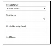
Focus on the information you need from users so that they can get started. You don’t want a user sitting at home thinking, “Why do they need this?!”
Indicate whether each field is required or optional, unless it’s all required.
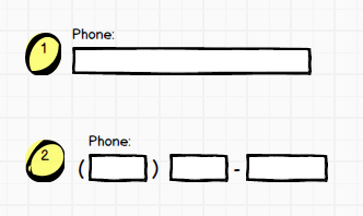
8. Name and phone number fields should be one field.
Instead of a first name and a last name field, just have a field that says “full name.” Instead of three fields for a phone number, use one.
The problem with multiple fields is interaction issues. Generally, a form design best practice is “the fewer fields, the better.”
Imagine using your mobile device and having to tap through five fields for name and number (two for name, three for number) instead of just two? Needless friction.
9. Offer radio buttons instead of drop-down boxes.
UX Movement argued that forms with select menus often get abandoned because they “take more time and effort to complete.”
More specifically, they claimed that they slowed users down by interrupting user flow, being hard to read, and requiring dexterous mouse maneuvering. They provided no supporting data.
Well, it’s easy to test. So we did. We were just launching a large survey on online trust perception, so we had an opportunity to manipulate a survey form and ask different people the same questions in different formats (multi-select vs. radio buttons).
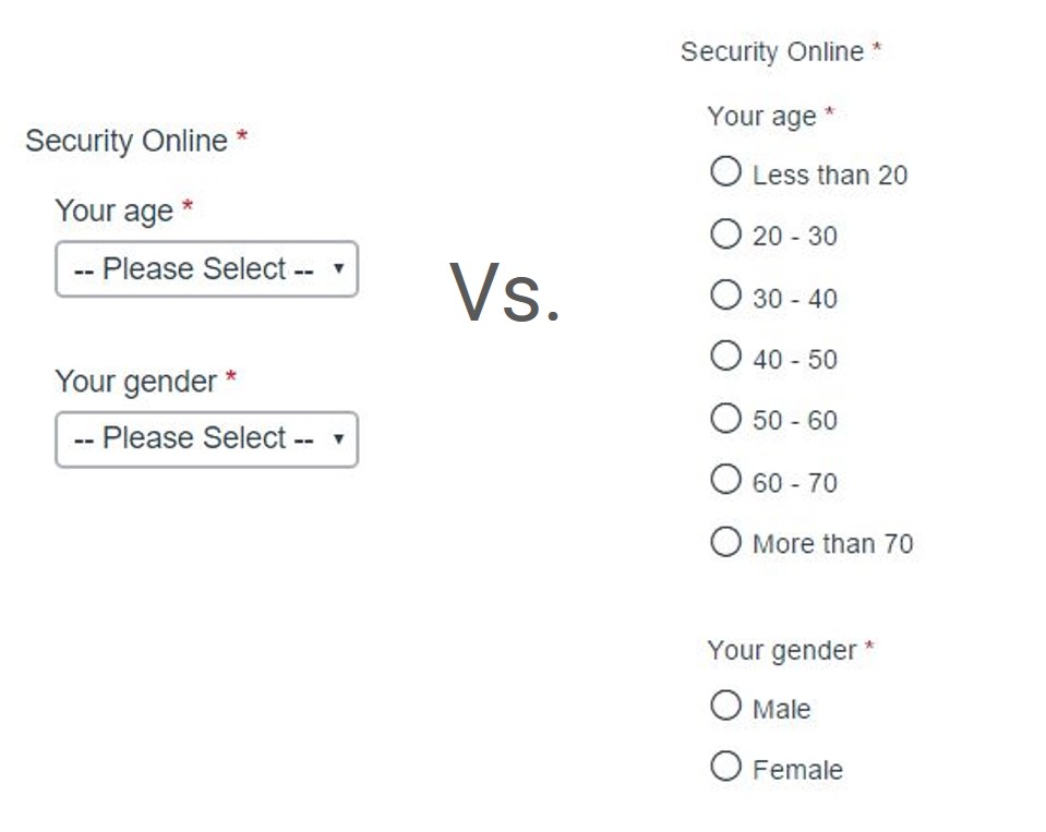
The results? The form with radio button was faster to complete. Survey participants completed the radio-button form (n = 354) an average of 2.5 seconds faster than the form with multi-select buttons (n = 354). This was significantly faster at a 95% level.
10. Don’t make coupon code fields prominent.
When people see an “Enter coupon code here” field, they feel less special. They think, “Why don’t I have one?” They get FOMO.
Many go to Google to search for a coupon. Some find coupons on third-party sites, which cuts into your profit. Many never return.
Leaving the site to search for coupons is a common reason for shopping cart abandonment.
So this is not a good idea:
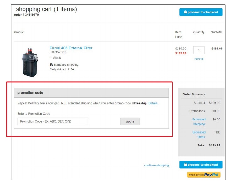
Instead of a large banner, have a text link saying, “Got a coupon?” (or something similar). If the user clicks the link, it should open an input field. Text links are not visually prominent, so fewer people will pay attention.
Customers who already have a coupon code will look for a way to enter it, so unless you hid it (too) well, they’ll still be able to apply their coupon. And if a customer has received a coupon (via email), apply it automatically and display the discount.
11. Avoid the “clear fields” button.
Nobody who fills in your form wants to clear the fields. If they don’t want to fill it in, they can just leave.
If they fill the form and accidentally clear the fields, there’s a good chance they won’t start over.
Mobile-specific form design best practices
While most of the above can be applied to mobile as well, there are some specific issues to keep in mind with smaller screens. Mobile users are less patient, and using a smartphone is more difficult than using a desktop.
We’ve got an entire post on the topic, so dive deep there. But if you want a couple of starting points, follow these guidelines.
12. Offer field focus.
If you have a form with multiple fields, you don’t want users to get lost in the form. This is especially..
Source link