Everyone loves Christmas, right? Consuming your body weight in eggnog and roasted meats and vegetables; spoiling your friends and family (and yourself); spending valuable time with your nearest and dearest.
What’s not to like?
But the festive season isn’t just about unbridled celebration.
In a survey of 10,000 consumers in 12 markets, Ipsos grouped open-ended responses into broad “conversational clusters.” The biggest cluster, “joyful,” was totally in keeping with the traditional festive spirit. But the fourth-largest cluster was far less positive: “anxious.”
Fact is, consumers have a lot on their minds right now. Many of us are still slowly adjusting to a post-pandemic world. High inflation is tightening purse strings. And buying exactly the right present for your parents, your partner, and your second cousin’s toddler can be a thankless—and stressful—task.
Anxiety breeds uncertainty. And uncertainty means more convoluted buying journeys and a higher rate of cart abandonments. All of which is bad news for retailers desperate to end the year on a high.
So what can you do to make consumers’ lives easier (while persuading them to part with their cash)?
Website popups are the perfect solution, allowing you to…
- Capture customer data to fuel your email campaigns
- Offer timely discounts and promotions based on behavior
- Showcase key seasonal messaging, offers, and information
…and much more besides.
With that in mind, I’ve raided our best practice vault and studied some of our favorite brands to pick out some of the most inspirational, engaging, high-converting Christmas popup examples.
1. Create a Popup Advent Calendar
What could be more festive than an advent calendar?
Although they’re more of a European tradition, advent calendars are still pretty popular in the US, with one-third of American households planning to have some sort of advent calendar in 2022.
It doesn’t take a marketing genius to work out that the day-by-day action of opening an advent calendar is a perfect fit for a daily deals-style ecommerce campaign. The process is pretty simple:
- Plan a different deal for every day leading up to Christmas (or just run the campaign on select days—the choice is yours). It could be a sitewide discount, a percentage-off sale on a specific product category, free shipping, or something else entirely.
- Create data capture popups that prompt customers to submit their name and email address in exchange for today’s deal.
- When customers fill in the form, hand over the relevant discount code and add them to your mailing list.
Here’s an example of how that might look, built with our simple-to-use popup maker:
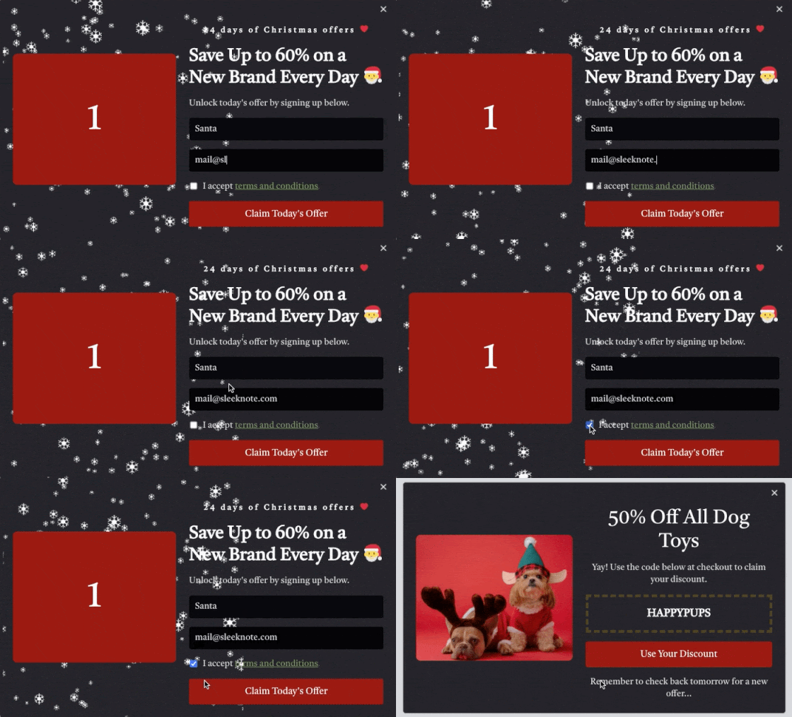 Of course, an advent calendar campaign isn’t just about rewarding customers with a one-off discount. It’s also an opportunity to bring them back to your website day after day—which means more sales and revenue.
Want to know the best news?
Drip makes it super simple to run advent calendar campaigns. Check out our step-by-step guide to create your own.
2. Recommend Gifts With a Sidebar Popup
I’ve already alluded to the fact that Christmas shopping is pretty darned stressful for a lot of consumers.
When it comes to buying gifts online, one study found that 25 percent of shoppers worry about purchasing apparel in the wrong size, while 18 percent fear their gifts may turn up late.
And that’s just scratching the surface, with the same survey revealing a host of other gift-buying stresses, including:
- Choosing the wrong color
- Leaving the price tag on
- Getting the recipient’s mailing address wrong
Unfortunately, as a retailer, there’s not much you can do to stop Uncle Frank sending his nephew’s gifts to Springfield, Missouri rather than Springfield, Massachusetts.
But you can definitely point shoppers in the right direction by using sidebar popups to provide product recommendations:
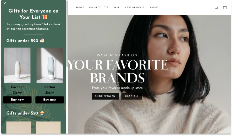 In the above example, the recommendations are segmented by price. But there’s really no limit to the types of recommendations you can offer. Try recommending product types by:
- Hobbies and interests. Examples: Gifts for sports fans; gifts for book lovers.
- Demographic information. Examples: Gifts for dads; gifts for new parents.
- Popularity. Example: Our bestselling gifts of 2022.
Even better, test multiple product recommendation popups to find out what works best for your audience.
3. Add USPs to Popups
With roughly 1.3 million ecommerce companies in the US and Canada alone, consumers have never had more choice at their fingertips.
This is both a blessing and a curse for ecommerce marketers.
On the one hand, if the barriers to entry weren’t so low and the opportunities so attractive, your brand might not even exist.
But on the flip side, it means you’re almost certainly in a highly competitive niche. Unlike in the “old days”, when your biggest rivals shared your zip code, today they could come from anywhere in the US—or even further afield.
Let’s be honest: if you’re competing solely on price, you’re locked in a race to the bottom. There’s always going to be someone prepared to undercut you.
For that reason, you need to give each and every consumer who visits your website a compelling reason to purchase from you.
Once again, a website popup is one of the best ways to make this happen. Because they’re so eye-catching, there’s a strong chance people will sit up and take notice.
So what do shoppers want to hear? That might vary from market to market, but a good starting point is to answer your audience’s most common questions, such as:
- When will my product arrive?
- What happens if the recipient doesn’t like their gift or wants to exchange it for a different size?
- Will I have to gift-wrap it myself, or can you do it for me?
Here’s what that might look like:
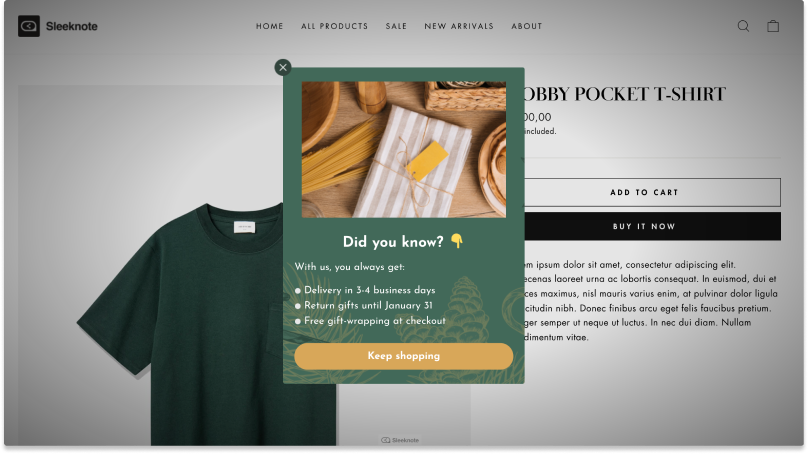 The above example shows a USP-related popup on an imaginary product page.
This raises an important point: what’s the best place (and time) to display your website popups?
It’s about striking a balance between maximum exposure and maximum action. Naturally, you want lots of people to see your key festive messaging. But you also want to display it at the most impactful moment—such as when they’re weighing up whether to buy a product.
As ever, my advice is to test, test, and test some more. Because no two audiences are exactly alike. See what works best for your audience and do more of it.
4. Run Exit Intent Popups
While we’re on the topic of popup timings, one of the most effective times to display a popup is when the user is about to navigate away from your website.
Think of exit intent popups as the onsite equivalent of abandoned cart emails. You know the customer is about to leave, so you make a last-ditch, Hail Mary attempt to convince them otherwise.
Even as an avid popup enthusiast, I have to admit that exit intent popups can be annoying.
You’re trying to go about your day, then BAM, a popup gets in the way. There are times when I’ve vowed never to visit a specific website again because the exit intent popups were so intrusive.
For that reason, I only recommend adding these popups to your most valuable, action-oriented pages.
Don’t place them on your homepage. If customers are considering leaving before they’ve got any deeper into your site, they almost certainly aren’t ready to buy anyway. So it makes no sense to pester them.
Instead, save them for your product and checkout pages.
Another key point: exit intent popups need to add value.
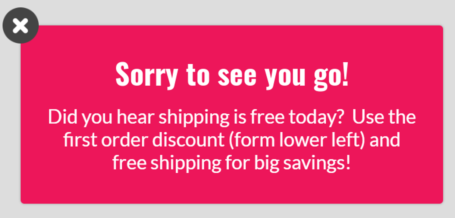
Don’t just beg and plead with customers to change their mind; give them a concrete reason to stick around and buy. For example, acrylic wall art brand Bumblejax uses exit intent popups to promote its free shipping and first order discount promotions:
5. Spell Out Your Shipping Policy
Shipping can be a key deciding factor for consumers at any time of year.
There’s plenty of evidence to back this up. For instance, a study from Retention Science found that online shoppers are twice as likely to respond to “free shipping” offers than promotions offering a percentage discount on a product. Moreover, an estimated 56 percent of all shopping cart abandonments come about through shipping-related concerns.
As December 25th approaches, shipping becomes an absolute deal breaker. Simply put, if the customer can’t get hold of a product fast enough they’re definitely going to look elsewhere.
But it’s not just about delivery speed—price is an important factor too. According to Think With Google, 75 percent of holiday shoppers plan to buy from retailers that offer free shipping.
The message here is clear:
- Let customers know—to the day, or even the hour—how much time they have left to buy and still get their product shipped in time for Christmas.
- Make it clear how much it’ll cost to ship their planned purchase.
This information is so important in the lead-up to Christmas that I recommend adding it prominently to every page—preferably in the form of a sitewide banner popup:
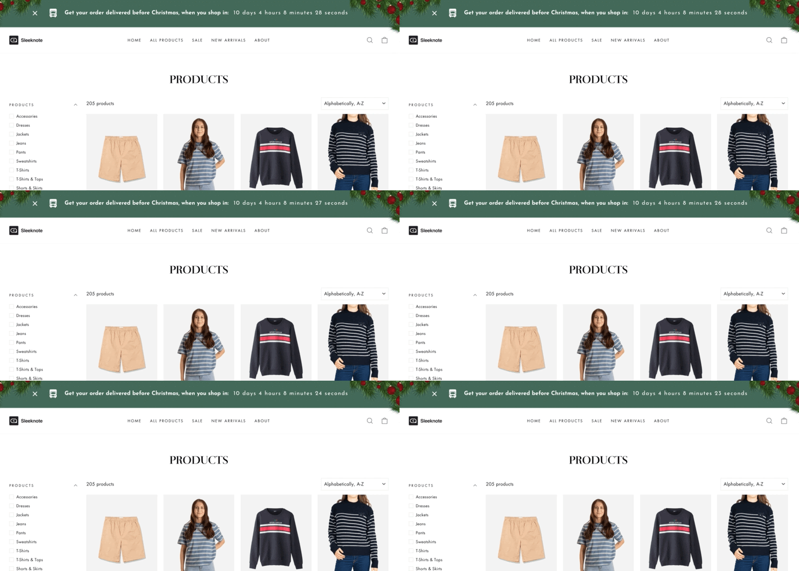 Not only does this approach encourage shoppers to buy while they still have time, but it also helps you avoid complaints from customers with unreasonably fast (or cheap) shipping expectations.
6. Use 1-2 Data Capture Fields
When it comes to capturing customer data, we marketers can be a greedy bunch.
We always want more, because we understand that data holds the key to delivering highly personalized (and highly persuasive) campaigns.
But there’s a problem: we’ve run the numbers, and it turns out that multi-field popups are about as popular as a glass of eggnog that’s been left out of the fridge overnight.
In our analysis, we looked at one million popup views, filtered any with fewer than 2,000 views, and analyzed the conversion rates for popups with between one and five input fields.
The results were conclusive: popups with one or two fields convert best, just like in this Christmas popup example:
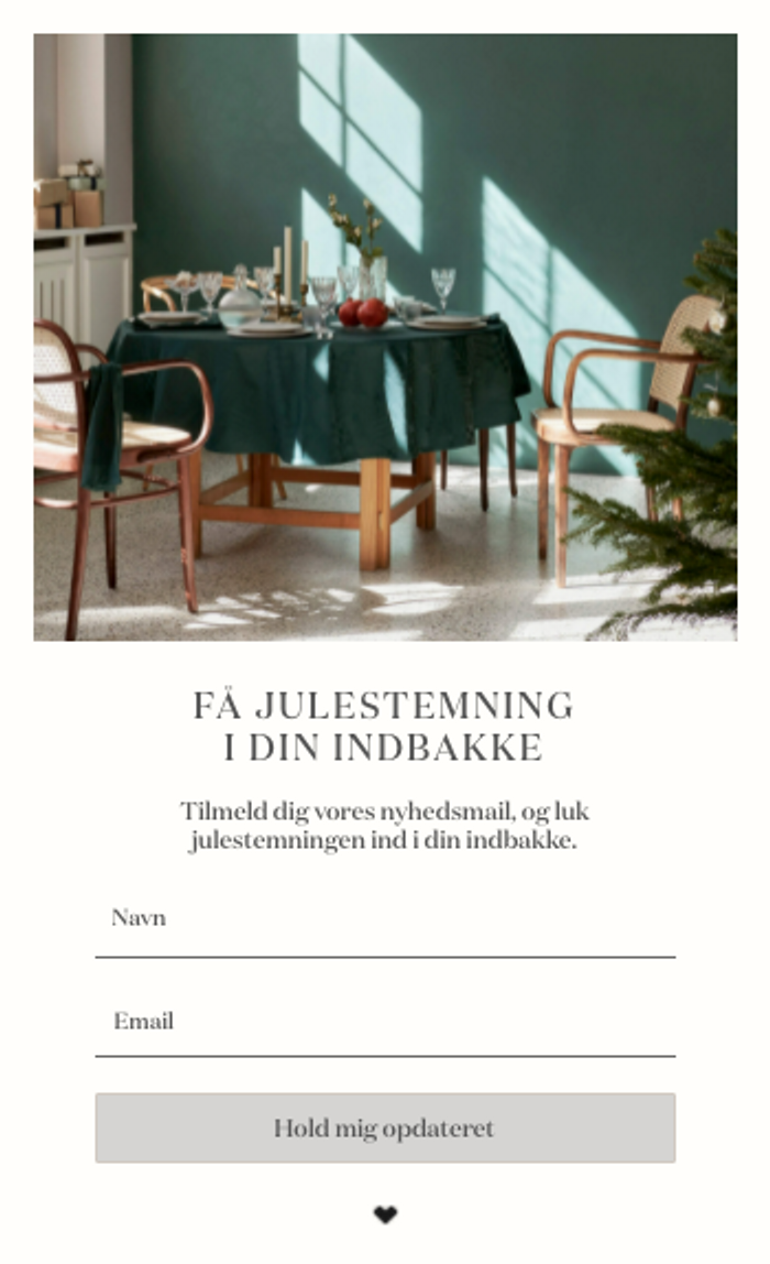 Interestingly, we discovered that two-field popups actually convert at a slightly higher rate than single-field popups, but only by 3.32 percent.
So it’s clear. If you’re looking to build your holiday mailing list or capture names and email addresses ahead of the January sales, one or two form fields is the way to go.
7. Gamify Your Popups
I’m not trying to sound like Scrooge, but Christmas shopping can be a drudge. It feels like there’s always one more present to buy.
So why not brighten up the shopping experience with a little gamification?
Of course, gamifying the shopping experience isn’t just about putting a smile on your customers’ faces; it’s also about driving sales and revenue. According to our data, when it comes to running giveaway-based incentives, gamified popups convert at an impressive rate of 20.76 percent, compared to just 7.66 percent for non-gamified popups.
What marketer would turn their nose up at a campaign in which one in five people converts?
If you’re not sure where to start with gamification, let me point you in the direction of the classic spinning wheel popup, as demonstrated by 0utdoor apparel and footwear brand ArdMoor:
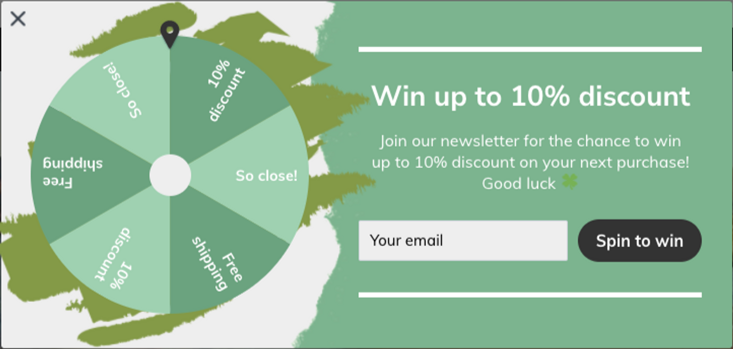 The idea is simple. Customers enter their email address in return for a spin of the wheel, which gives them a chance to unlock a discount or free gift.
Even if we suspect the result is predetermined, many of us just can’t resist hitting that “spin to win” button.
Build On-Brand Popups In Seconds With Drip
There’s another important point that I’m yet to mention:
If your popups look terrible, no one’s going to interact with them.
Fortunately, Drip makes it devastatingly simple to craft attractive, on-brand popups in just a few clicks. Start off with a pre-built template, then customize fonts, buttons, and styles to your heart’s content—all without forcing you to write a single line of code.
Sounds good? See for yourself by starting your 14-day free trial.
Source link


