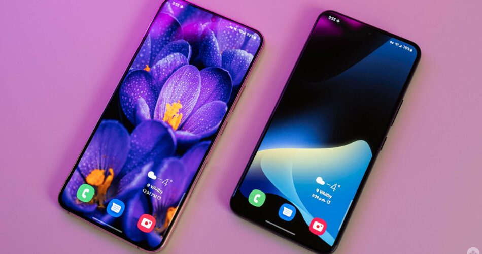
When Samsung unveiled its latest Galaxy S phones, the S22 Ultra stole the show. It’s not hard to see why – the Ultra is a new Galaxy Note in everything but name. However, Samsung’s Galaxy S22 and S22+ are also impressive, even if they are largely iterative over last year’s S21 and S21+.
Sporting a slight redesign and a minor spec bump, the S22 and S22+ feel refined where the predecessors felt rough. So far, my experience has been mostly excellent with the two phones. As a long-time Pixel user, for the first time in a long time, I’m not looking forward to switching from a Samsung phone back to my Google phone.
That said, the Galaxy S22 and S22+ are not perfect. I’ve had some issues with software and performance – nothing I’d consider to be a deal-breaker, but problems worth keeping in mind. Ultimately, those who use (and like) the modern Samsung smartphone experience will thoroughly enjoy the S22 series. If you’ve avoided Samsung phones because of software concerns, the S22 and S22+ improve (but don’t eliminate) those issues.
Most importantly, if you have an Android smartphone released anytime in the last few years, there’s a good chance the S22 series won’t offer anything to make the cost of upgrading worth it.
If you’re interested in reading about the Galaxy S22 Ultra, check out the full MobileSyrup review here.
Specs
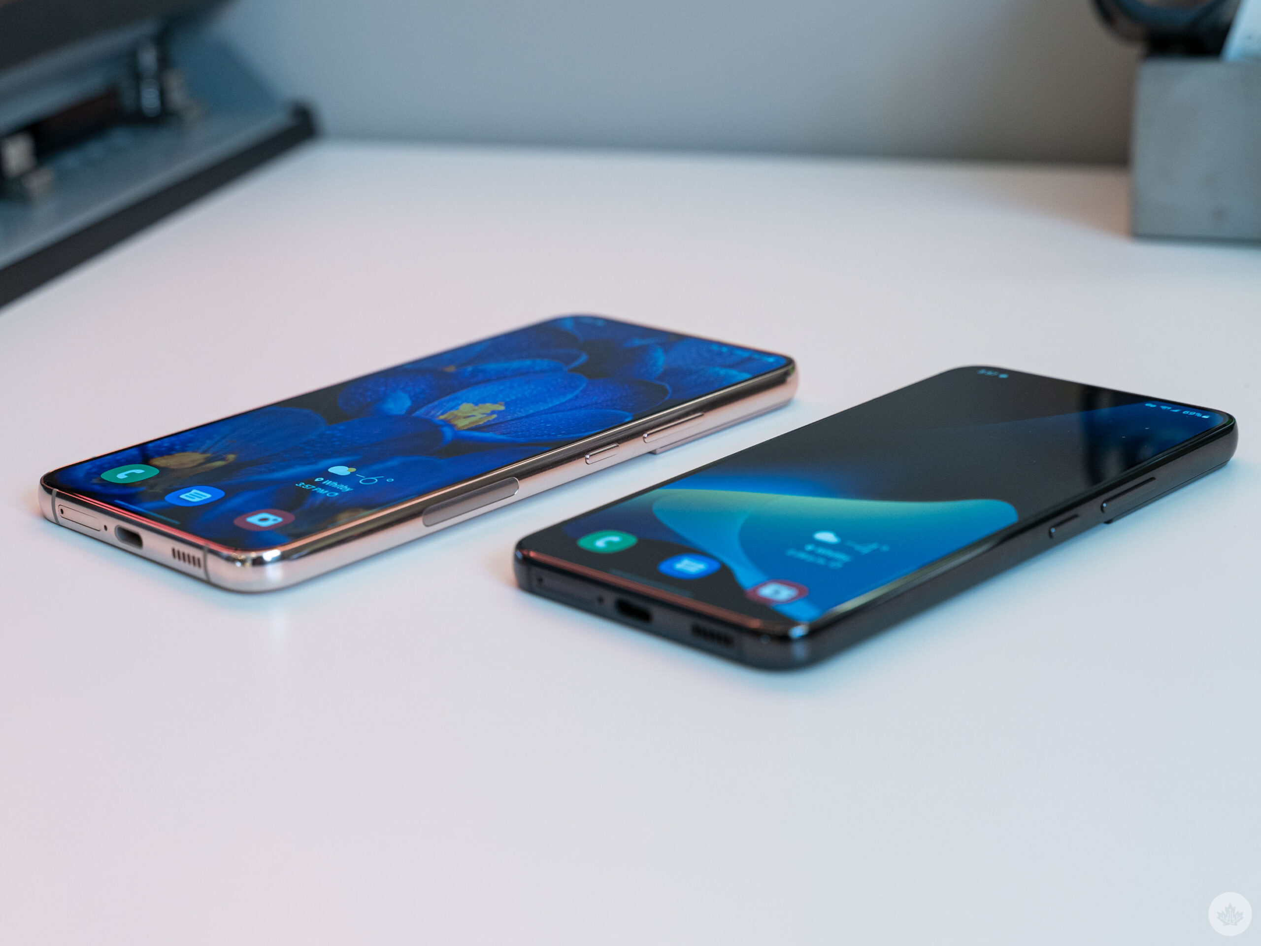
Before we get into the review, I want to make note that this review covers both the Galaxy S22 and S22+ because the phones are nearly identical. Beyond the size of the devices, screens, and battery, there is very little difference between the two smartphones. With that in mind, almost everything that follows in this review applies to both phones (and I’ll specify on the rare occasions things do differ). Below, you can find a spec comparison between the S22, S22+, S21 and S21+:
6.1-inch Flat Dynamic AMOLED, 1,080 x 2,400 pixels, 20:9 aspect ratio, 120Hz display, HDR10+, 240Hz Touch Sampling in Games
6.2-inch Flat Dynamic AMOLED, 1,080 x 2,400 pixels, 20:9 aspect ratio, 120Hz display, HDR10+
6.6-inch Flat Dynamic AMOLED, 1,080 x 2,400 pixels, 20:9 aspect ratio, 120Hz display, HDR10+, 240Hz Touch Sampling in Games
6.7-inch Flat Dynamic AMOLED, 1,080 x 2,400 pixels, 20:9 aspect ratio, 120Hz display, HDR10+
50-megapixel (f/1.8, wide) + 10-megapixel (f/2.4, 3x zoom) + 12-megapixel (f/2.2, 120-degree FOV, ultrawide)
12-megapixel (f/1.8, wide) + 64-megapixel (f/2.0, 3x zoom) + 12-megapixel (f/2.2, 120-degree FOV, ultrawide)
50-megapixel (f/1.8, wide) + 10-megapixel (f/2.4, 3x zoom) + 12-megapixel (f/2.2, 120-degree FOV, ultrawide)
12-megapixel (f/1.8, wide) + 64-megapixel (f/2.0, 3x zoom) + 12-megapixel (f/2.2, 120-degree FOV, ultrawide)
Fingerprint (in-display), accelerometor, gyro, proximity, compass
Fingerprint (in-display), accelerometor, gyro, proximity, compass
Fingerprint (in-display), accelerometor, gyro, proximity, compass
Fingerprint (in-display), accelerometor, gyro, proximity, compass
Colours: ‘Phantom Black,’ ‘Phantom White,’ ‘Green’ and ‘Pink Gold’ as well as Samsung exclusive colours ‘Gray,’ ‘Cream,’ ‘Violet’ and ‘Light Blue.’
Colours: Phantom Gray, Phantom White, Phantom Pink, Phantom Violet
Colours: ‘Phantom Black,’ ‘Phantom White,’ ‘Green’ and ‘Pink Gold’ as well as Samsung exclusive colours ‘Gray,’ ‘Cream,’ ‘Violet’ and ‘Light Blue.’
Colours: Phantom Silver, Phantom Black, Phantom Violet, ultra wideband
Best-feeling Samsung phone I’ve ever held
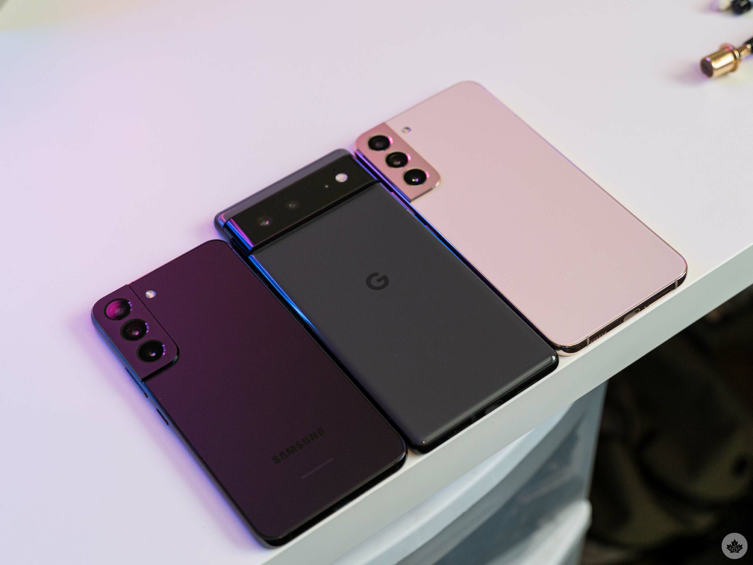
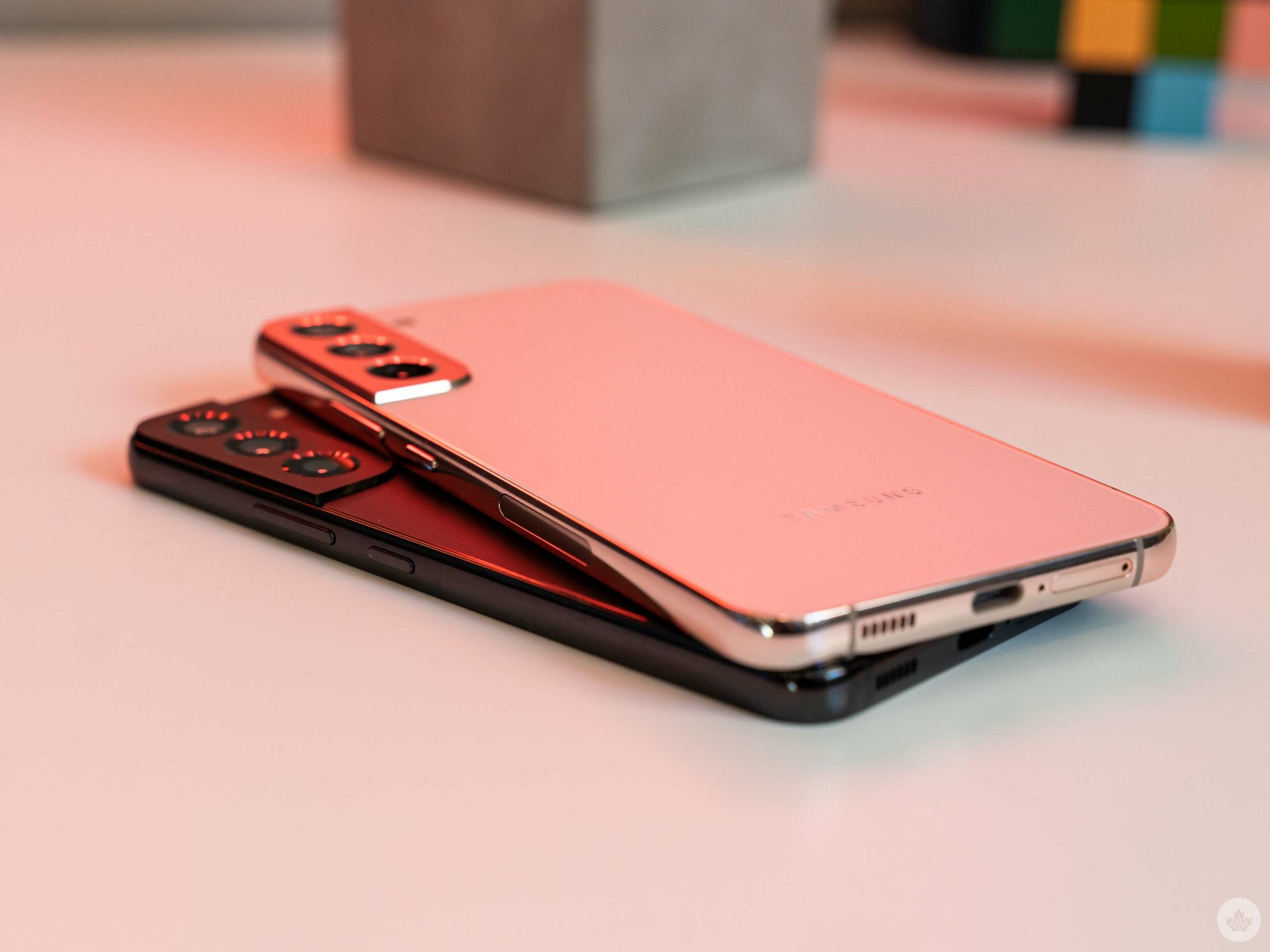
Love it or hate it, the biggest design change with the S22 series compared to the S21 line is the squared-off edges. I fall squarely (pardon the pun) in the ‘love it’ camp, but I understand why some people won’t. The squared edges can be uncomfortable when holding the phone, but I find Samsung generally nailed the feel. The S22 series never felt slippery to me – I had no qualms using the phones without a case, unlike some of the more slippery options out there (I’m looking at you, Pixel 6). I wouldn’t recommend going case-less – but if you want to, I think you can with the S22 and S22+.
The matte glass back panel really helps with this. As far as I’m concerned, every phone should have a grippy matte finish on the rear. Although I preferred the smaller S22 (I am one of the few who still likes smaller devices), the grippiness was enough that I felt comfortable using the larger S22+ as well. Aside from helping the grip, it also makes the phones feel much more premium.
Unfortunately, the frustrating button placement from the S21 line returns this year, with the power button residing below the volume rocker. A minor gripe, truthfully, but it took me a while to stop hitting the volume button whenever I wanted to turn on the phone. An easy solution, if Samsung’s committed to the button placement, would be to add a texture to the power button so it’s easier to find by feel.
The unique camera bump also remains a frustration. I love how it looks, but I keep hitting it with my finger when holding the phone in my right hand (especially on the smaller S22 since there’s less vertical space). It feels really uncomfortable – I swear Samsung made the edge of the bump sharper this year.
Faster, but not by much
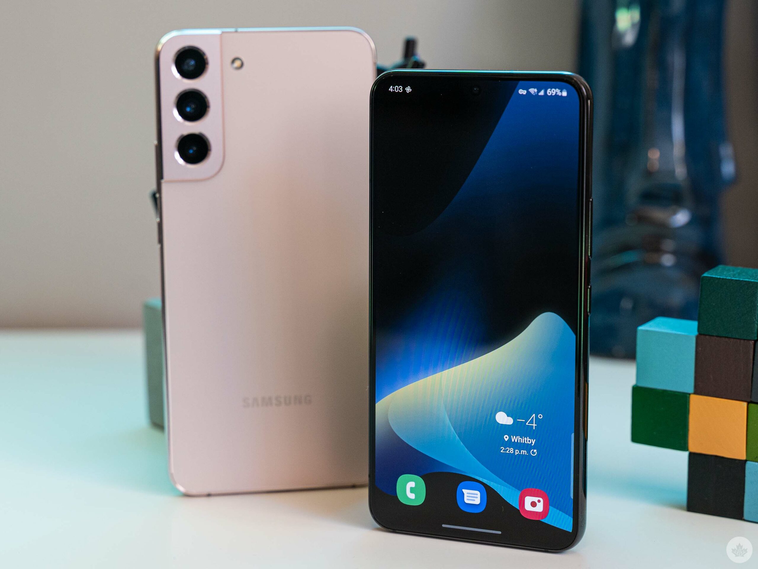
We already detailed the odd performance situation with the S22, S22+ and S22 Ultra in a separate article, but I’ll reiterate the main points here. The S22 series sports Qualcomm’s latest flagship chip, the Snapdragon 8 Gen 1. In benchmark tests, all the phones performed well but did not score noticeably higher than last year’s Snapdragon 888-equipped S21 Ultra. Moreover, some of the phones actually performed worse than the S21 Ultra.
It’s not entirely clear what’s going on here, but MobileSyrup wasn’t the only publication that encountered the issues. It’s likely that some kind of thermal throttling is at play – my S22+ performed the best and never got noticeably warm in tests, while the S22 and my colleague Dean Daley’s S22 Ultra did get warm and had worse performance.
Of course, benchmarks are not the be-all and end-all. In day-to-day use, the S22 and S22+ are both excellent performers. The 8GB of RAM is more than enough to keep most of my apps open and running, contributing to faster launches and easier switching between tasks. The phones were so good at keeping apps alive in the background that I ran into issues with a few apps not switching between light and dark mode – some apps wait until they’re not in use to make the switch.
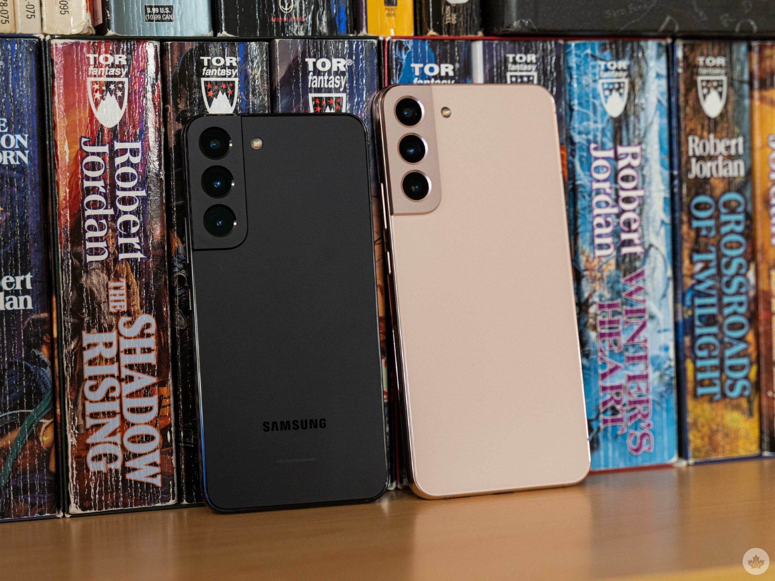
Games also performed well, although I didn’t play many since I’m not much of a mobile gamer. Navigating the phones felt fast and smooth, apps loaded quickly and generally the experience was really great. The only app I had consistent trouble with was Twitter, which seemed to not get along well with the 120Hz display. It had really janky scrolling – if I did a ‘fast’ scroll where I quickly flicked my finger to zoom through tweets, it’d stutter. But with a slow scroll, it seemed to work fine. I’m not entirely sure what was causing the weird, stuttery scroll but an update will (hopefully) fix the problem. I didn’t encounter that issue in any other app.
Overall, I was happy with the performance on offer from the S22 and S22+, but I wouldn’t list it as a reason to get the phone. Given the marginal (at best) performance improvement over the S21 series and other phones with the Snapdragon 888, anyone with a 2021 smartphone could save their cash and stick with Qualcomm’s older chip.
The battery life question
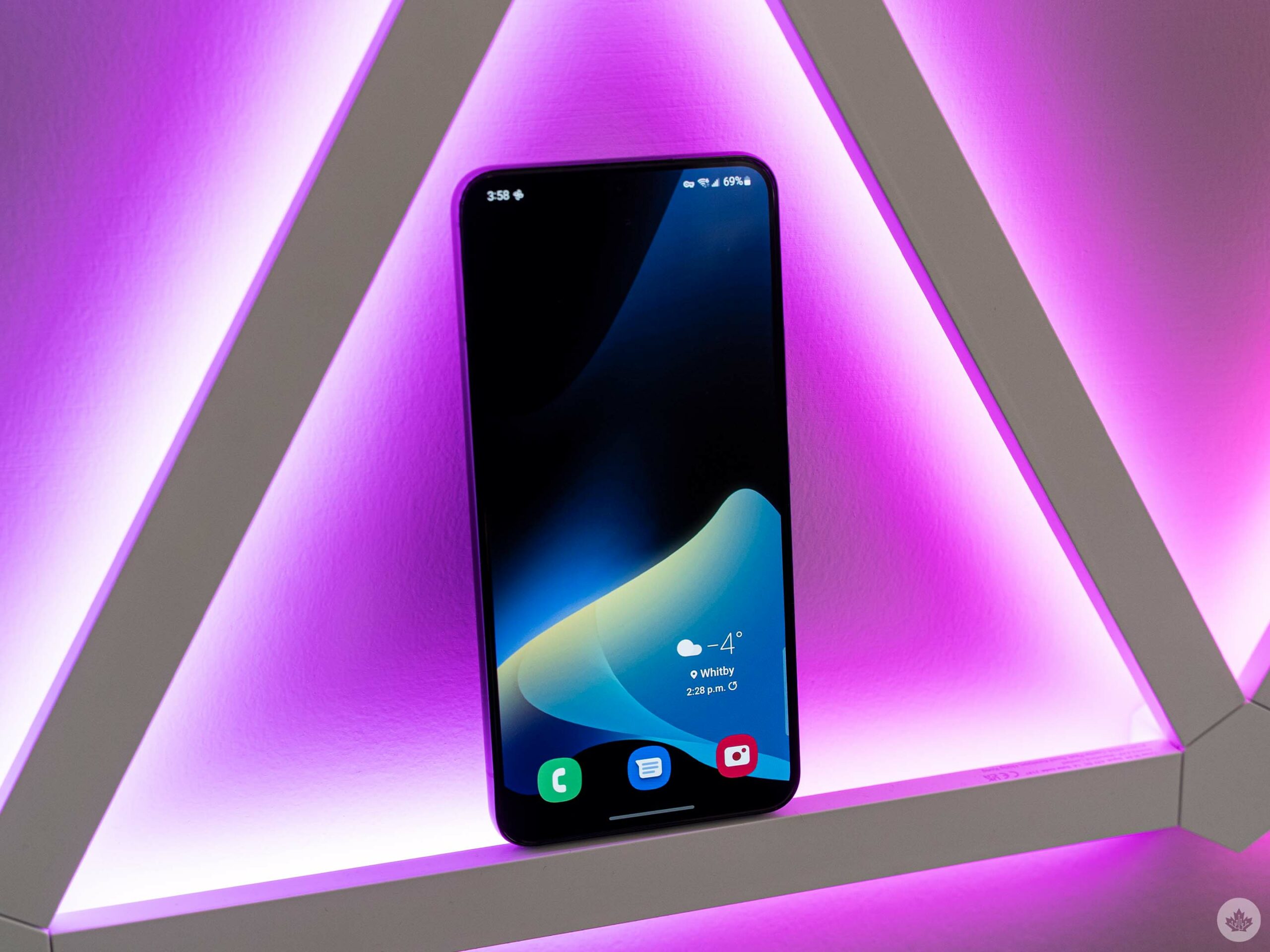
There’s been a lot of concern over the battery life with the S22 series considering the smaller batteries compared to previous models. The S22 offers a 3,700mAh and the S22+ a 4,500mAh cell, compared to 4,000mAh and 4,800mAh on the S21 and S21+ respectively. Coupled with a higher resolution display, there’s definitely good reason to be concerned.
Ultimately, your battery life experience will come down to how often you use the phone. It feels like the Snapdragon 8 Gen 1 has improved power consumption when idle, which helped extend the S22 battery on light-use days. However, if you do a lot of gaming or other heavy tasks, you’ll still burn through the battery quickly.
On days where I used the S22 a ‘typical’ amount for me – which involves browsing social media, messaging friends and co-workers, and watching the occasional YouTube video – I’d get to the end of the day with about 30 percent left in the tank and somewhere between three-and-a-half to four hours of screen on time (with the 120Hz adaptive display option turned on). You may be able to eke out a little more battery by locking the phone to 60Hz, but I’m not sure it’s enough to warrant going back to 60Hz.
On the days with above-average use (like when I tested games or ran benchmarks), the S22 often needed a top-up before the end of the day. The S22+ fared better thanks to its larger cell and, despite having a bigger screen, it’s the same number of pixels. I didn’t find the difference made a significant impact. If you’re planning to buy either phone and really want the best battery life, the S22+ is the way to go.
One UI 4.1 is the best Samsung skin yet, but it’s still a Samsung skin
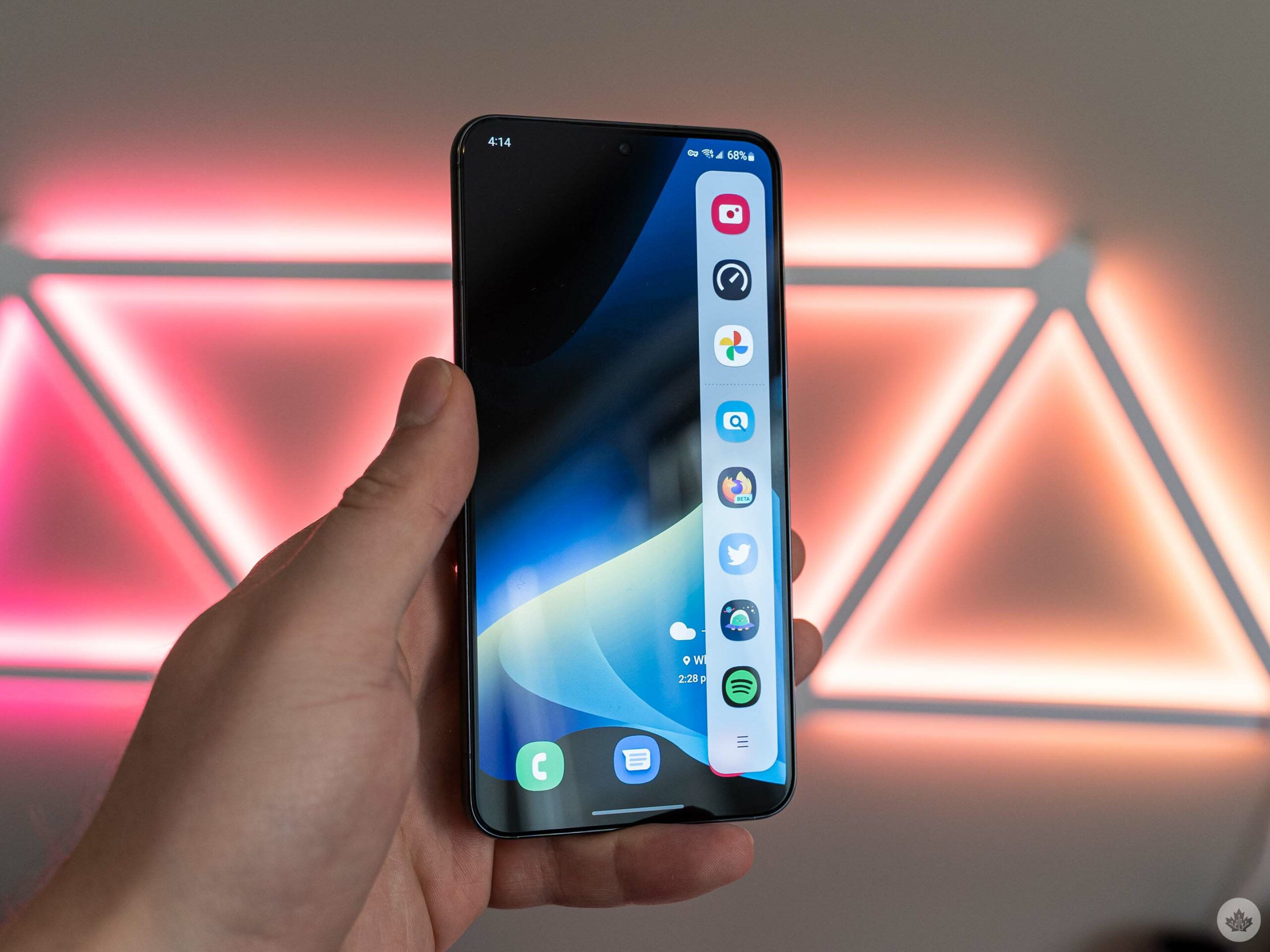
As is usually the case with Samsung phones, the hardware is excellent and the software is… not.
I have mixed feelings about One UI. I think it’s much, much better than TouchWiz, but it’s still a far cry from the more consistent experience you get from a Pixel phone or iPhone (granted, Pixel phones have their own share of UI problems, but I’d still take it over One UI).
The Galaxy S22 series runs One UI 4.1 on top of Android 12. One UI 4.1 supports the colour-changing theme engine Google introduced with Android 12 – it’s a nice touch, but limited. Samsung’s take on it only applies colours to certain UI elements, like the quick settings toggles, while maintaining the same colours in apps. It can make for a more disjointed experience compared to the theming on Pixel phones, where apps do adapt accordingly. That applies mostly to the default apps, with third-party apps not following colour schemes on either phone.
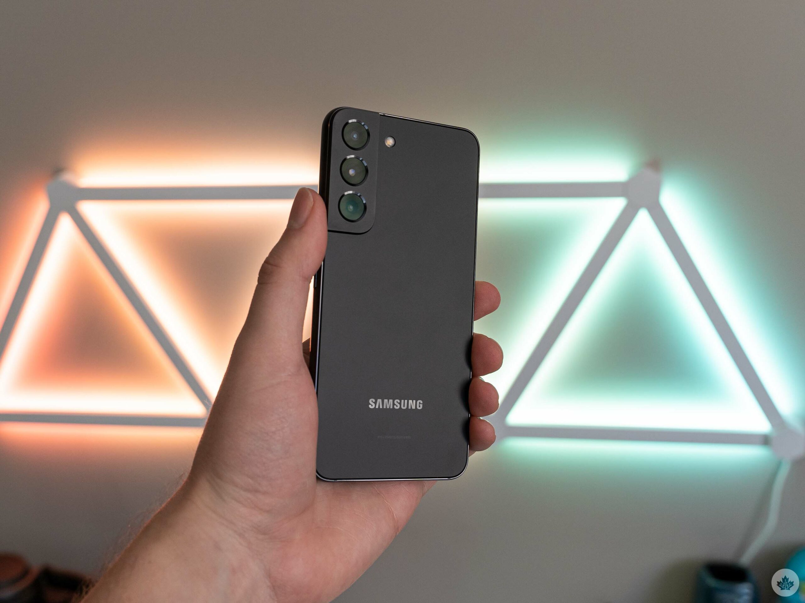
One UI 4.1 still utilizes Samsung’s somewhat unique app layout that pushes content down to the bottom half of the screen, making it easier to reach stuff. However, while I like that feature, it remains available only in a select few Samsung apps that I don’t use, or awkwardly shoe-horned into the Samsung-ified Google Messages app, where it looks completely out of place alongside the rest of the app’s design.
Other things I’ve come to appreciate on the S22 include the Edge Panel for quickly launching apps – I’ve avoided this in the past, but I actually really like it now that I’ve tried it. Samsung’s Clock app puts this handy little widget on screen when you set a timer so you can keep an eye on how much time is left while you do other things. Several aspects of the UI are extremely customizable as well. It’s great if you want to take the time to tweak things, but annoying since the defaults often aren’t great – that leaves most people with a mediocre experience when better options are hidden a few taps away.
Set-up woes and the problem with pre-installed apps
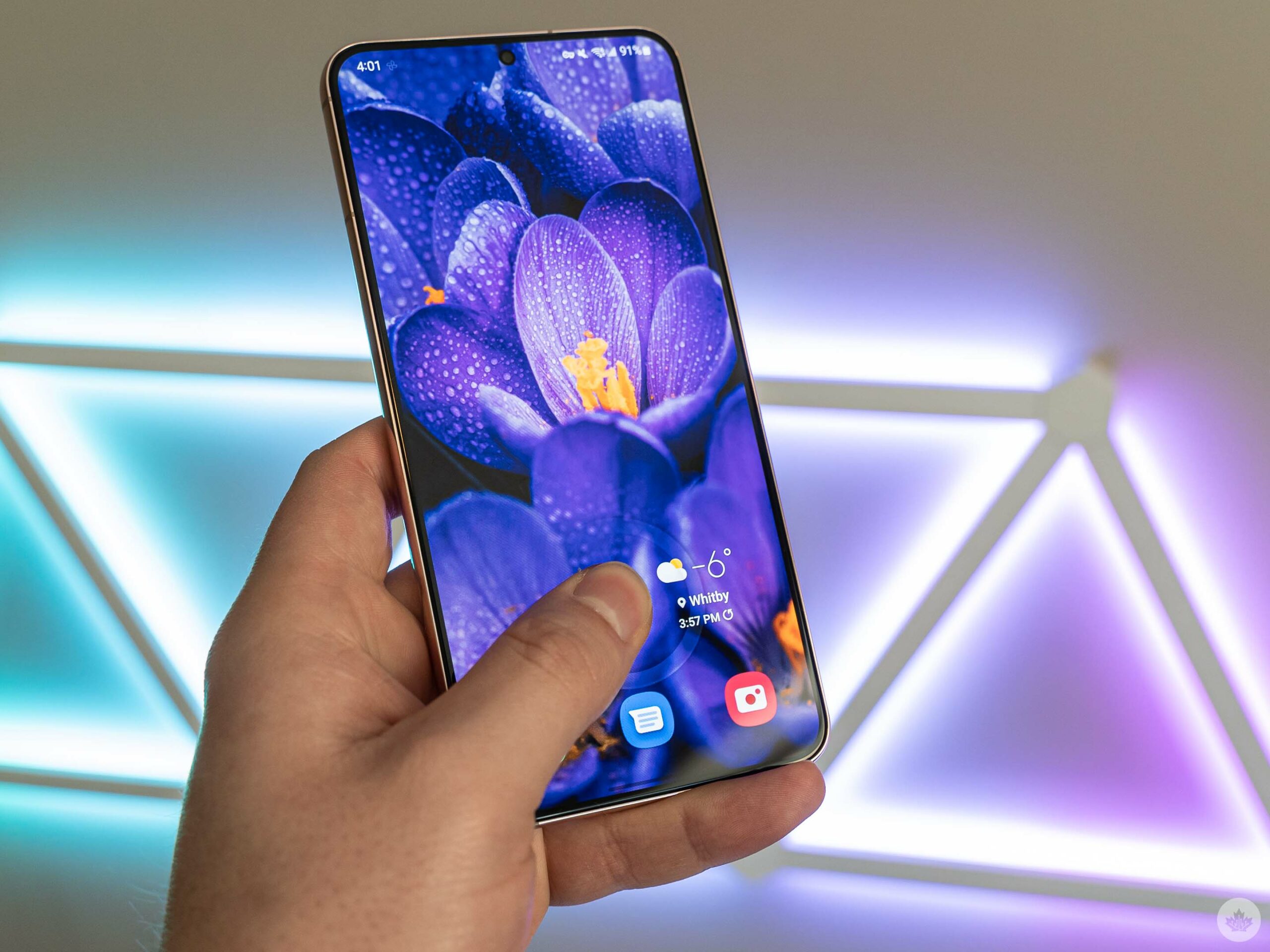
In-display fingerprint scanner in action — it works quite well.
I also really like Samsung’s default launcher, although it isn’t without issue. Many of the problems start with the initial set-up, which as Android Police so eloquently put it, is the “worst part” of using a Samsung phone.
Since I was reviewing both the S22 and S22+, I had to suffer through the process twice. On the first go ‘round with the S22+, I tried to bring over my data from the Pixel 6 I was using. Samsung tried to force me into using its Smart Switch app, which didn’t work at all. I was eventually able to bypass Smart Switch and restore a backup of my Pixel 6 through Android’s default data transfer system. That generally worked all right, although my apps ended up in a jumbled mess because Samsung insists on organizing the app drawer in order of installation and not alphabetically like most phones.
Perhaps more frustrating was that many of my other settings didn’t translate over, which meant for the first time since I last used a Samsung phone, I had to go through and set up all my automated features like dark mode, Night Light, Do Not Disturb, and my carefully-curated notification settings that help keep the unending spam out of my notification shade. I’ve had no issues transferring these settings on other Android phones.
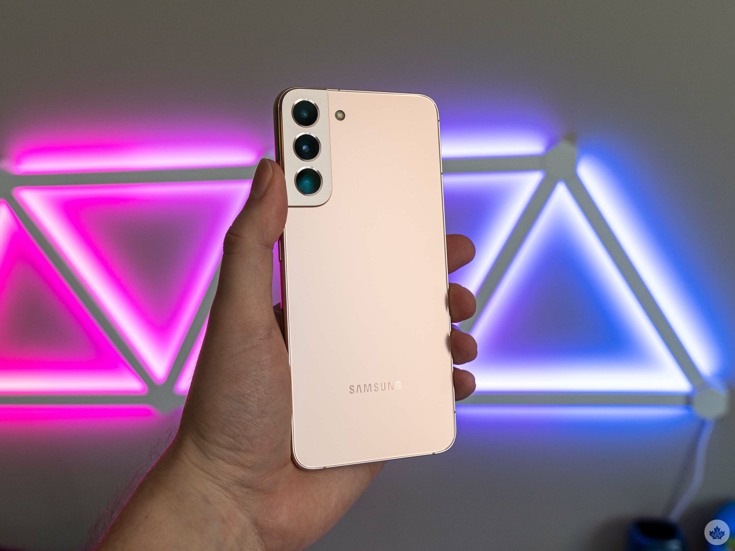
With the S22, I thought it’d be better to use Smart Switch and copy the data from the S22+ after the problems moving from the Pixel 6 to the S22+. Well, Smart Switch was worse. Not only did it fail to copy all my settings again, but it also didn’t bring over any of my app data, which meant I had to log into all my apps again (and lost progress in the few games I had tried). Great.
On top of this, there’s plenty of bloatware that comes pre-installed on Samsung phones, often in the form of duplicate (or sometimes triplicate) apps. For example, Samsung has a default email app, but most Android phones also come with Gmail pre-installed. However, Samsung also has a deal with Microsoft that includes pre-installing several Office apps, including Outlook! That’s three email apps installed on a phone out-of-the-box with no option for users to pick the one they’ll actually need or use. Plus, when you put your SIM card in, Samsung phones install several apps from your carrier too.
You can remove some of these apps, but others you can’t – with the S22, I deleted over 10 pre-installed apps, and there are still 12 apps on the phone I don’t want, don’t use, and can’t remove. Perhaps the most annoying is Samsung’s Calendar app, which insists on taking over the phone with a fullscreen alert whenever I have an upcoming calendar event instead of, you know, using the standard banner notification that every other app uses.

Some of you will take to the comments to argue that these are just “little inconveniences” that don’t really matter much. Well, they are little inconveniences, and they add up. Given that Samsung is still the most popular Android phone maker, the company’s phones are Android to the majority of people outside the tech sphere. And for those people, little inconveniences can be a deal-breaker when things don’t “just work” and fixes aren’t readily available.
At least Samsung’s apps don’t have ads in them anymore – it’s a small win, but one I’ll take anyway.
Camera blues
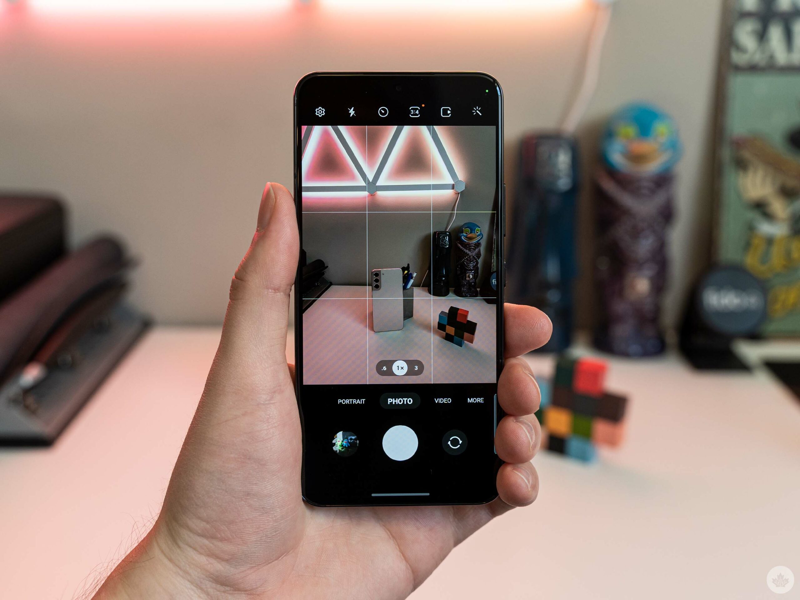
I generally liked the S22 and S22+ camera setup. Once again, this aspect of the phones is the same – you can check the comparison shots below:
S22
- S22 Ultrawide
- S22 Primary
- S22 3x
- S22 30x (max)
S22+
- S22+ Ultrawide
- S22+ Primary
- S22+ 3x
- S22+ 30x (max)
Pixel 6
- Pixel 6 Ultrawide
- Pixel 6 Primary
- Pixel 6 2x
- Pixel 6 7x (max)
I found in most shots, the S22/S22+ camera leaned blue, which worked great in some photos and not so much in others. For example, I found it improved the look of the sky in some shots, even though it was less true-to-life than the Pixel 6, which more accurately captured the greys.

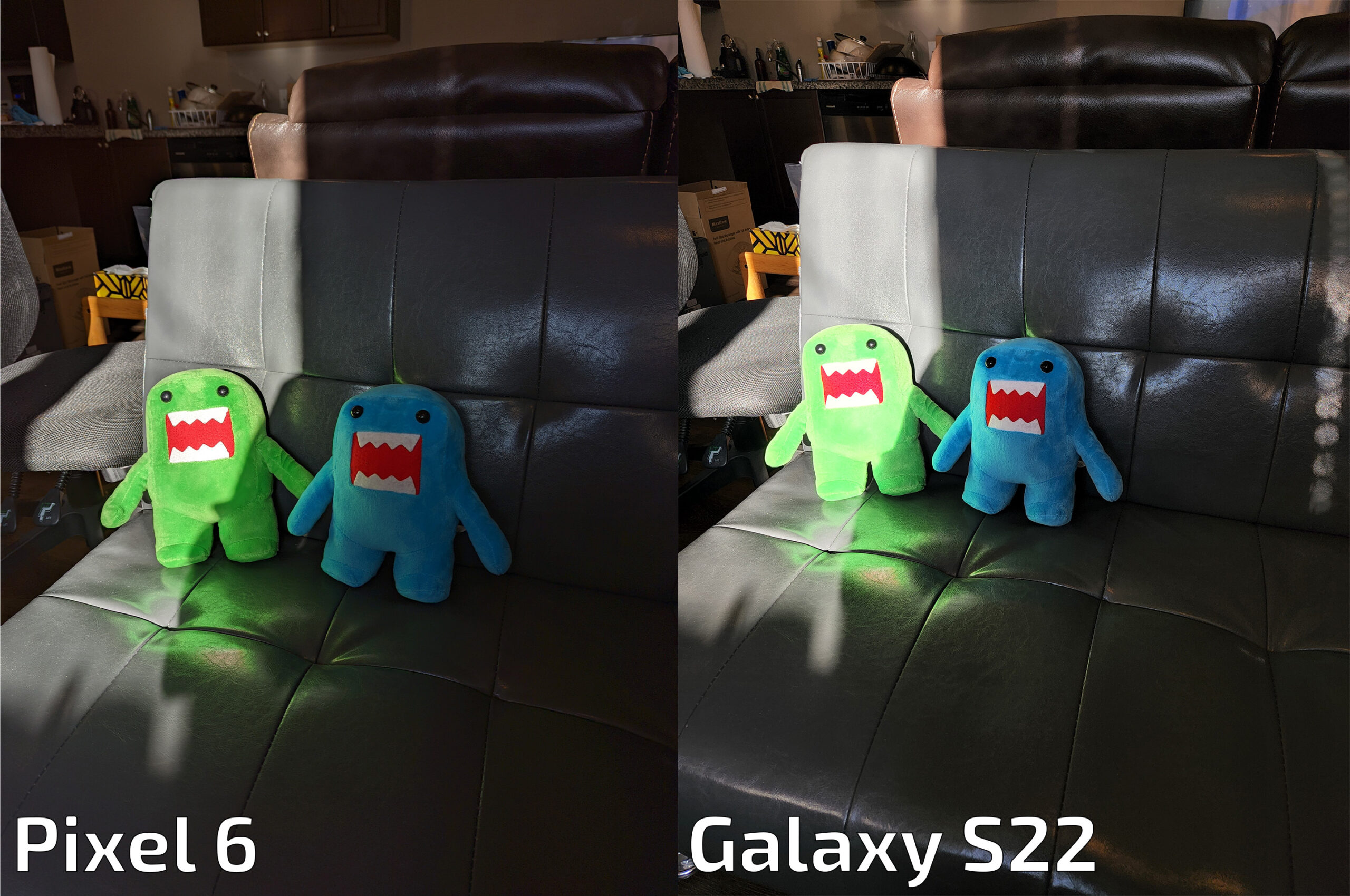
In the above, the S22 shot is actually a little more accurate to the blue colour of the paint on the gazebo poles, whereas the Pixel 6 rendered them more grey. I also found the S22 tended to maintain contrast more, with the Pixel 6 HDR doing more to brighten shadows. However, that wasn’t always the case — in the example below, the S22 over-exposed the bright area, while the Pixel 6 kept things in check with a darker image overall.
When it comes to zoom, Samsung’s camera can get closer, but the quality definitely falls off as you zoom. The 3x zoom generally looks fine, but the visual quality degrades even at 10x – going to 30x (the maximum) leaves pictures looking blurry. At a certain point, I wonder what the value of the extra zoom is since in many cases it looks quite rough when you inspect the images.
When it comes to portrait mode, Samsung definitely improved its edge detection this time around, matching or beating the Pixel 6 in my tests.
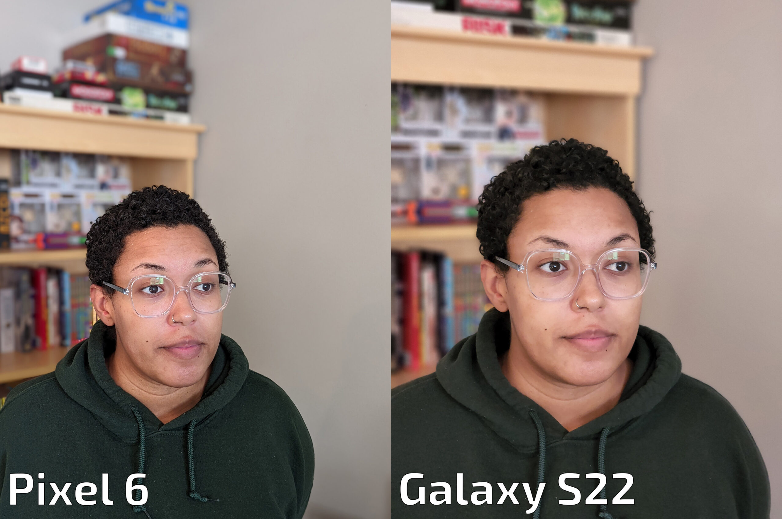
In the above shot, note how the Pixel 6 failed to properly blur a small part of the bookshelf behind the subject’s ear, while the S22 camera basically nailed the edge detection. The S22 also zooms in more for portrait shots. The above also serves as a great example of how Samsung’s cameras tend to lighten and smooth skin tones, resulting in a less accurate image.
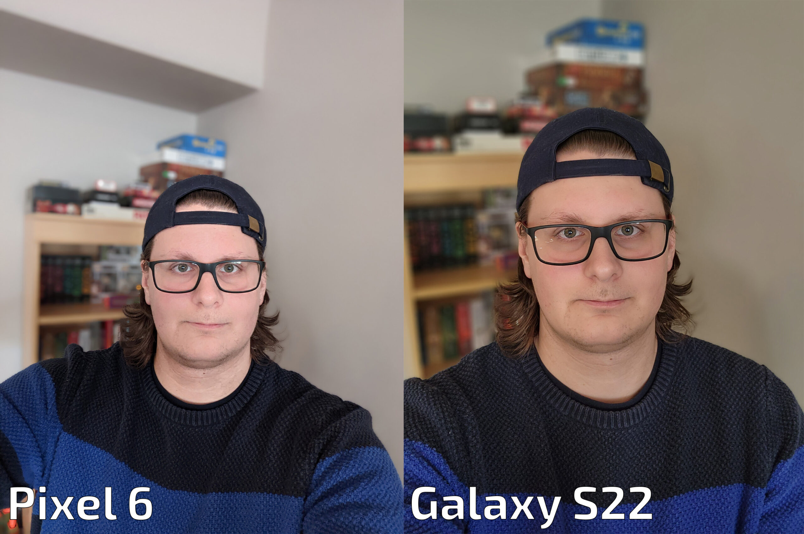
The selfie camera also worked well, although I found it produced less exposed images. Still, the quality is exceptional — the Pixel 6 image doesn’t hold up as well when you zoom in — and both cameras struggled with edge detection on the hair around my neck, although admittedly that messy hair is a difficult task for any portrait mode.
Don’t buy for 5G
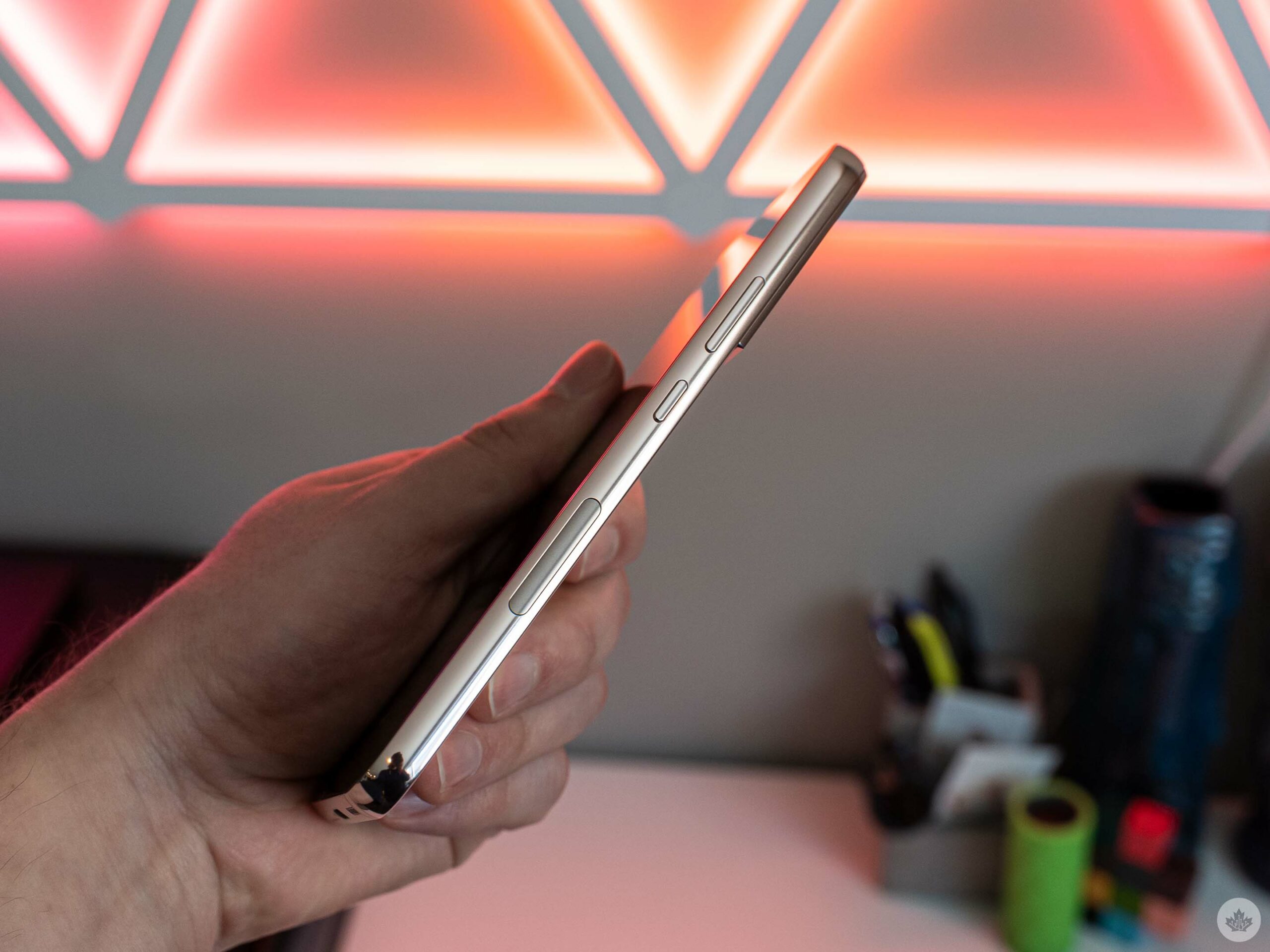
Note the 5G mmWave antenna placement on the side of the S22+, which isn’t present on the S22.
If you’re thinking about picking up an S22 or S22+ to get in on some of that much-hyped 5G action, don’t. Both phones will be great when 5G actually comes to Canada, but the currently-available 5G is lacklustre in most places.
I was only able to run 5G tests on the S22 since, for some reason, the S22+ unit Samsung provided me would not connect to 5G (the S22+ also didn’t download any carrier apps when I set it up, so I wonder if maybe it needed some carrier software to get 5G working, but I’m not totally sure). The S22 did download carrier apps and connected to 5G with ease, although I’m not sure it was worth doing. One final note, I ran the tests with a Bell SIM and I’m based in Whitby, Ontario – other carriers and people in other regions might get better results.
First, my 5G speed test results came back with some pretty inconsistent results with scores ranging from 88Mbps down on the low end to 153Mbps on the high end. Granted, that was faster than Bell’s 5G on the Pixel 6, which scored between 66.5Mbps and 86.1Mbps. On LTE, the Pixel 6 pulled 104Mbps down compared to the S22’s 74.4 down on LTE. The S22+ was better at 92Mbps down on LTE – again, I couldn’t test 5G on it.
I don’t attribute these mediocre scores to the S22 series being bad – I think Bell’s coverage, at least where I am in Whitby, Ontario, sucks. I switched to Bell in early 2021 after the carrier offered me a sweet deal – before that, I was on Koodo. When I ran speed tests with my Koodo SIM for my Pixel 4a 5G review, I saw LTE speeds of up to 431Mbps down, which is pretty bonkers. Koodo doesn’t offer 5G service, but then again, it doesn’t seem to need it considering how much faster the LTE was compared to Bell’s 5G. That said, Koodo recently added speed caps to its plans, so new customers won’t be able to enjoy 400+Mbps download speeds on Koodo anymore.
All this is to say 5G is not a great reason to buy these phones. That will hopefully change in the future, but Canadian 5G continues to disappoint.
Source link


