It takes more than an eye-catching design and a few blog posts to build an effective B2B website. The user journey, design, messaging, performance, and structure all play their own part when it comes to creating a website that supports lead generation and builds opportunities in your pipeline.
9 ways to generate more leads from your website
1. Reorganise website navigation
A well-structured B2B website uses clean and intuitive navigation. In fact, 94% of people agree easy navigation is the most important website feature.
Current website best practice dictates that you put your service pages in your primary navigation to help visitors quickly find your most valuable products and services. Ensure visitors are never more than a couple of clicks away from the information they need. This will increase the average time on site and make it easier for search engine crawlers to navigate and classify your pages.
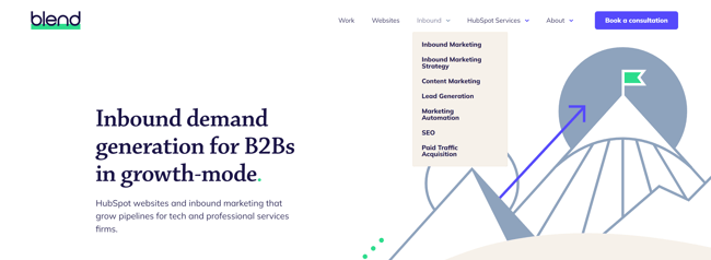
Our website uses pared-back navigation to help visitors find what they’re looking for.
Not sure how to organise your main navigation? Consider visitor intent.
High-value pages, like your product and service pages, should feature prominently. Resist the temptation to put everything into one huge navigation bar. You don’t want to overwhelm visitors the first time they visit your site. In our experience, a pared-back navigation that focuses on the critical content for purchase improves engagement and increases bottom of the funnel conversions.
2. Improve the structure of your pages
It takes the average person between 3-5 seconds to decide if they want to stay on your website. So to convert leads, you must structure your pages in the most engaging and user-friendly way possible.
This starts at the top. Create a header that clearly and succinctly communicates your value proposition, so visitors understand instantly what you do and who it’s for. Reinforce your value proposition with a hero image or other visual element that catches the reader’s eye.
The main body of the page is where you can provide visitors with a bit more information about your products and services. Don’t get bogged down in specifics. Less is more where web copy is concerned. Focus instead on these key areas:
- Points of differentiation. What distinguishes you from your competitors?
- Social proof. Use customer logos, testimonials, and case studies to build trust and establish credibility.
- CTAs. Add conversion points so you can offer the right content at the right time.
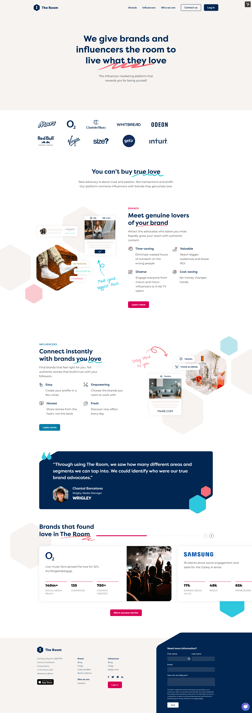 The Room’s well-structured homepage puts the company’s bold and passionate messaging front and centre – supported by streamlined navigation, carefully-placed CTAs, and a generous helping of social proof.
3. Add contextual internal links
Contextual internal links are an important part of modern site structure.
The primary goal of these links is to direct visitors to related areas of interest on your site. Contextual links guide people who need more information, without shifting the focus away from your primary CTAs. Additionally, internal links establish a clear information hierarchy on your website and help to spread link equity.
Include links in your blog content that direct visitors to your website and pillar pages. This shows search engines and your prospects which pages are relevant to which topics.
Blend Recommends
Relevance is an essential component of effective internal linking. Linking to random articles for the sake of it will only confuse the reader. It also harms SEO. If there’s no rhyme or reason to your internal links, search engines will struggle to understand your offering.
Choose your anchor text carefully. Ensure it gives readers a clear sense of the source page’s topic and, if possible, includes an exact match keyword. This gives both the reader and Google some much-needed context.
4. Build effective landing pages that convert
Landing pages are dedicated pages on your website that support specific products, services, campaigns, or offers. They use targeted copy to engage with visitors and inspire them to take the desired action. That could be booking a free trial, registering for an upcoming webinar, or downloading an ebook.
To quote HubSpot “landing pages are the hub of your lead generation efforts”.
Unlike your homepage, which serves as the gateway to your products and services, a good landing page focuses on visitor conversion. This makes them particularly effective for promoting gated content.
An effective landing page contains:
- Clear and compelling copy. Write engaging copy that demonstrates the value of your content or offer and directs visitors towards your form.
- Remove navigation options. Landing pages have one objective: to convert visitors into leads. Remove superfluous navigation options and internal links to keep the focus on your offer.
- A clear call to action. Your CTA should stand out from the rest of the page and leave visitors in no doubt about the action you want them to take. Use verbs like “download” or “read” to set their expectations.
- A form. An effective landing page needs an effective lead generation form. Place it above the fold so it’s immediately visible and easy to find. The less scrolling visitors have to do, the better.
Done well, landing pages provide prospects with a risk-free conversion path that builds trust and confidence in your brand.
5. Include CTAs aligned to the buyer’s journey
Like landing pages, the purpose of a CTA is to encourage visitors to take a specific action. Your website should have multiple CTAs across your pages and content, each aligned to different stages in the buyer’s journey.
HubSpot identifies two main types of CTA: primary and secondary.
A primary CTA is the main action you want users to take when they visit your site. It should appear in a prominent position on every page – in your main navigation, for example. A typical primary CTA could be:
- Book a demo/consultation
- Contact sales
- Sign up/register

Our primary CTA stands out at the top of our site and appears on every page.
Secondary CTAs are more contextual. As the name suggests, they provide alternative actions visitors can take. For example, you might include a CTA at the end of a blog that encourages them to download a guide or register for an upcoming webinar.
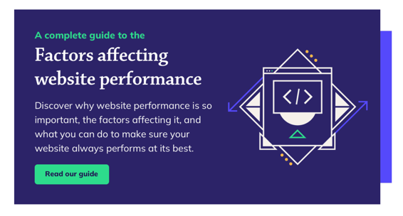
We recommended including a CTA at the bottom of every blog to give visitors an alternative conversion opportunity.
Placement, relevance, and wording are the key to creating CTAs that converts.
Your primary CTA should be clear and prominent so there’s no confusion about the action you want visitors to take. Secondary CTAs should be relevant to the topic at hand, so you can deliver the right content, at the right time.
What makes a good CTA?
- Be specific and predictable. Your audience should know exactly what they’ll get when they click on your CTAs.
- Show the value of your content. “Read our introduction to B2B inbound marketing and learn how to generate leads” is more effective than a simple “read our introduction to B2B inbound marketing”.
- Stimulate action. Use imperative verbs like “explore” or “request” to give visitors agency and encourage them to act.
- Consider context. Use the right CTA for the right piece of content. For example, it doesn’t make sense to include a CTA on cloud security in a blog about cost optimisation.
6. Use forms that are easy to populate
Forms remain the most effective and ethical way to collect contact information.
Unlike HTTP cookies, forms are a fair exchange of data between you and your visitors. They hand over their contact details, you provide them with a useful piece of content that aids in their purchasing decision or helps them along the buyer’s journey.
When a visitor voluntarily shares their information with you by completing a form, they’re demonstrating their interest in your products or services.
Forms are synonymous with landing pages and gated content. But that’s not the only place you can put them. For example, we include a simple lead generation form in our website footer to make it as easy as possible for visitors to get in touch.
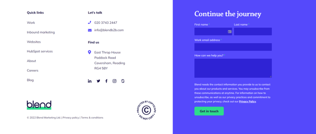
The contact form in our footer invites visitors to learn more about our services.
7. Write pillar pages to demonstrate your authority
Pillar pages demonstrate your subject matter authority and improve your website’s SEO. And that, in turn, fuels B2B lead generation.
Unlike your service or product pages, the secret to writing an effective pillar page is answering is to answer specific questions your audience may have on complex or niche industry topics. They offer a level of detail that simply isn’t possible in a standard blog post, complete with relevant links that provide additional value to the customer journey.
Always think about your audience when selecting suitable topics for your pillar pages. Just because you think a topic is important, doesn’t mean your prospective customers will agree. And if they aren’t interested in what you have to say, you won’t generate leads.
Keyword research platforms, like SEMrush, offer valuable insights into the popularity of key search terms and the intent behind them. This helps you create compelling and relevant pillar pages that meet a genuine need amongst your audience.
8. Create topic clusters to help rank for key terms
Topic clusters are relevant and engaging pieces of content that are carefully linked into clusters around a pillar page. Together they create a contextual ecosystem that can help build website lead generation.
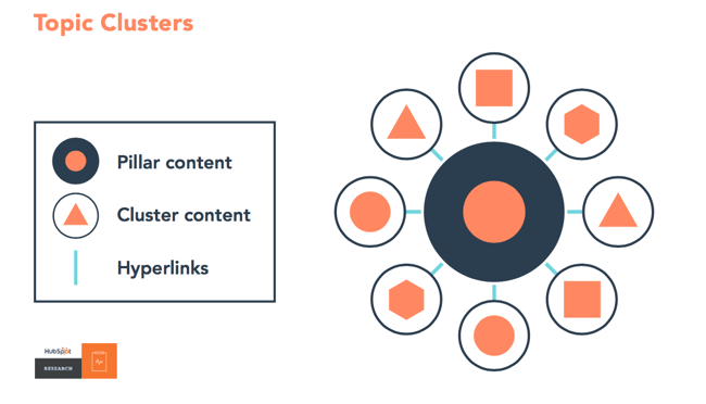
“The topic cluster model, at its very essence, is a way of organizing a site’s content pages using a cleaner and more deliberate site architecture” Credit: Matt Barby, HubSpot
Cluster content allows you to target relevant industry keywords efficiently and at scale. It allows you to provide more detailed information on the key topics that you cover in your pillar pages. For example, you might create a blog on disaster recovery or ransomware prevention to support a pillar page on enterprise cyber security.
Use distinct keywords in your cluster content to avoid cannibalisation.
You don’t always have to create new cluster content.
Optimising, repurposing, and reorganising existing content into topic clusters can also support your lead generation efforts. An article you published in 2019 may not be driving traffic to your website, but it may be more accessible in a new format. Put simply, refreshing content is more efficient and cost-effective than starting from scratch.
Other forms of gated and ungated content you can create to support lead generation include:
- Whitepapers
- eBooks
- Guides
- Case studies
- Infographics
- Videos
- Webinars
- Podcasts
9. Optimise the performance of your website
Many website factors can affect website performance and impact customer experience. For many visitors, it’s their first interaction with your business, and the experience can make or break their perception of your brand.
A slow, poorly optimised website can make you look unprofessional. Some visitors may even question the level of security on your site. It can also affect visitor retention and SEO. Prolonged load times breed frustration. Google research found that bounce rates increase by 32% when load times increase from 1-3 seconds. And while page speed isn’t as important as relevance when it comes to search ranking, poor performance can negatively impact traffic, lead generation, and conversion.
According to Portent, website conversion rates drop by almost 5% with each additional second of load time. Similarly, nearly 70% of online retail customers say page speed influences their purchasing decisions.
To maximise your chances of ranking in SERPs, you must ensure your website loads fast and performs well.
How to improve the performance of your website:
- Choose the right CMS – one that provides 24/7 support, fast page load speeds, and built-in security features.
- Deliver content over HTTP2
- Use a content delivery network (CDN)
- Implement effective browser caching
- Compress graphics, images, and videos
Start generating leads through your website
Today, an effective B2B website is one that serves generates qualified leads for a business. Getting the above elements right will not only help you generate more leads through your website but create a high-performing marketing asset that will continue to delight your visitors.
Source link


