Editor’s take: Google.com feels like one of the friendliest pages on the internet. It stood out in the days of Yahoo as being one of the simplest search engines, and it stands out now as one of the few sites that don’t clamor for your attention with news and messages. But wait.
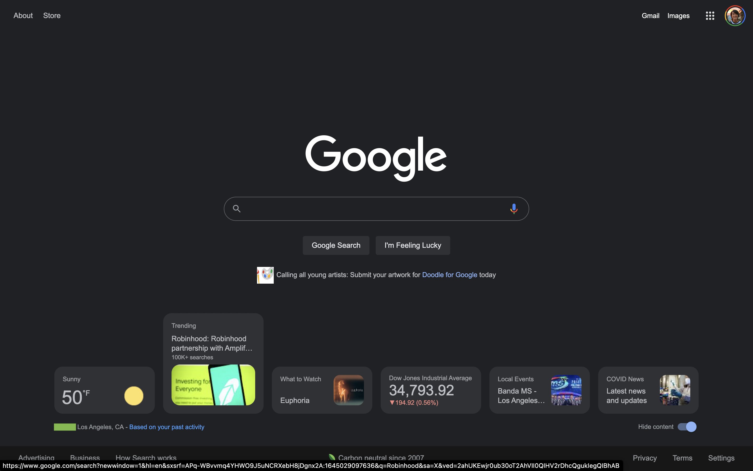
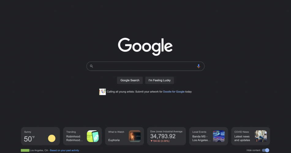
Soon Google.com could change. According to 9to5Google, the company has been testing adding a row of cards to the bottom of the page. The screenshot above shows six cards. Staples like the weather and the news are on the sides, and in the middle are stock prices, links to shows and movies, and recommended websites. It’s a similar catalog to what you’d find in the Google Discover app.
Even though it looks like a feed, it isn’t. There’s no way to scroll and access more cards and if you shrink the browser window, some of the cards disappear. Mousing over them (see below) makes them pop up and reveal more information.

Under the cards, on the left, is a little disclaimer: “Based on your past activity.” On the right is a toggle to hide or reveal the cards.
Reports indicate that only a small percentage of users can see the cards, so as usual it sounds like Google is doing A/B experimentation and rolling out the feature to a small number of random users for now.
Source link


