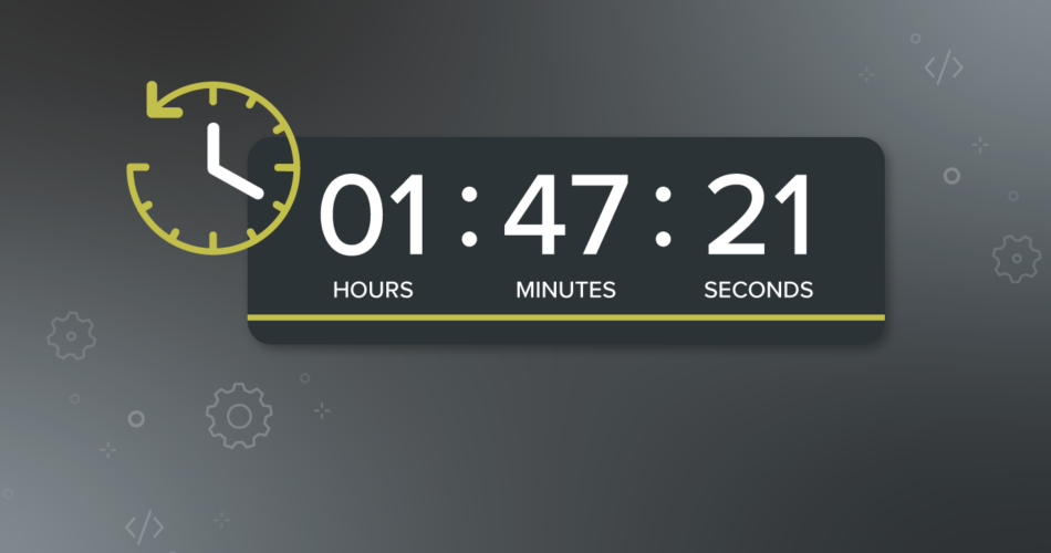
Countdown timers are a quick, effective way to boost engagement—whether they’re for sales or newsletter sign-ups. Introducing urgency into the inbox encourages email openers to take action. As a powerful visual tool, countdown timers are a tried and tested tool to build anticipation and encourage action.
There are plenty of questions people still have about utilizing countdown timers to their advantage. Read on to learn:
We’re going to take you through some of these questions and give you the answers to enhance the use of countdown timers and show some great email examples, including some which are included in Kickdynamic’s Best Emails of 2021 showcase.
When should you add a countdown timer?
Timers are versatile and can be used for many different things.
- In retail, they’re predominately used to countdown until the start or end of a promotion. They’re also used a lot to visually show delivery information (e.g. 2 hours left to shop for next-day delivery).
- Fashion brands also use them for new launches, events, and fashion shows. In travel, it might be a countdown until travel.
- Media outlets might use them to show the time left until your subscription expires.
Whatever the use case, they’ll add something extra to your email.
A great tip is to not use timers too frequently. You don’t want your subscribers to become fatigued. Use them for big events, promotions, or personal things like a birthday or holiday countdown. We’d also recommend not using timers when the promotion ends too far in the future—short bursts and short time windows mean openers are more inclined to take action.
What kind of messaging should you use?
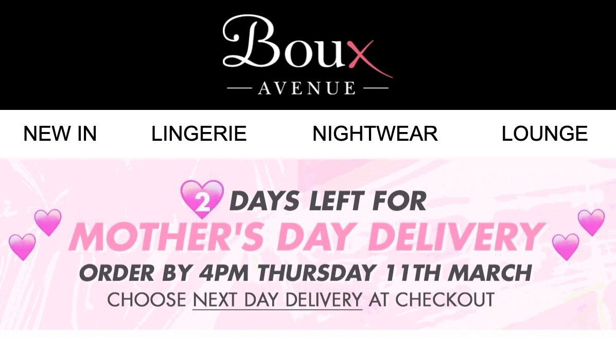
A timer without clear messaging is pointless and confusing. Some emails have a timer placed at the top with no details explaining why it’s there. Yes, there might be a big promotional banner further down the email but the timer at the top has no connection to the message. Be smart and put a very clear message close to the timer stating what it’s counting down to.
This example from lingerie retailer Boux Avenue is a great example of using clear, informative messaging, but still keeping the brand’s identity at the forefront.
How should you label a countdown timer?
You should make sure you put time labels on every countdown timer for the same reasons as having clear messaging: clarity. Recipients need to know how long they have left before the timer runs out. It’s that simple.
Don’t forget to include days, hours, mins, etc., as this makes it much clearer for the person reading the countdown timer. Using only numbers can be confusing and render the countdown timer pointless.
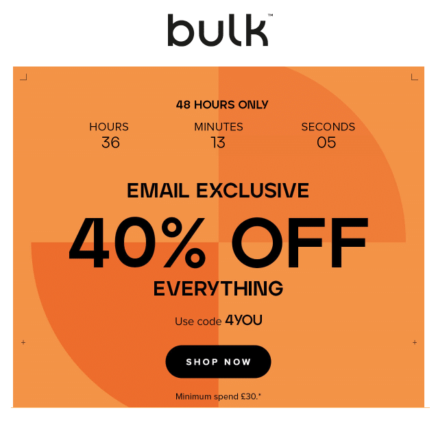
In this great example from sports nutrition and wellness retailer Bulk™, the countdown timer is used extremely effectively. They have clearly marked out the hours, minutes, and seconds in the header image. They also have clear and bold messaging which is hard to ignore.
What about a call-to-action?
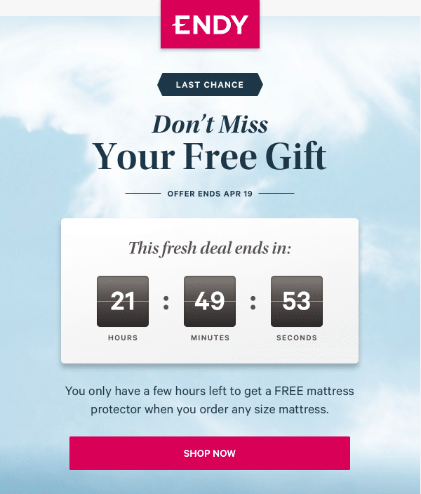
Ensure to put a call-to-action (CTA) with your countdown timer. From our insider knowledge, we can tell you that lots of people click on the timer within the email so make sure to incorporate a CTA in the design or place one close by.
This email from Canadian retailer Endy includes a “SHOP NOW” CTA button right in the header image, beneath the timer. By adding the CTA close to the countdown timer, it encourages recipients to click.
Where should you position a countdown timer?
The positioning of a countdown timer is very important. The closer to the top of the email, the better. By making the timer one of the first things a customer sees, it will encourage them to click sooner.
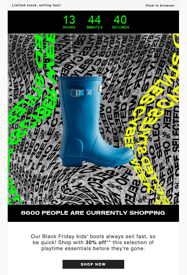
This email from Hunter Boots is placed at the very top of the email, making it the very first thing seen when the recipient opens. The great use of contrasting colours draws attention to it even more.
What type of timer should I use?
There are many different types of timers and they serve the same (and different) purposes! Of course, they’re all counting down to something but with differing degrees of urgency. For example, using only the number of days if you’re counting down to something further away, and then using hours, minutes, and seconds as the promotion draws to a close.
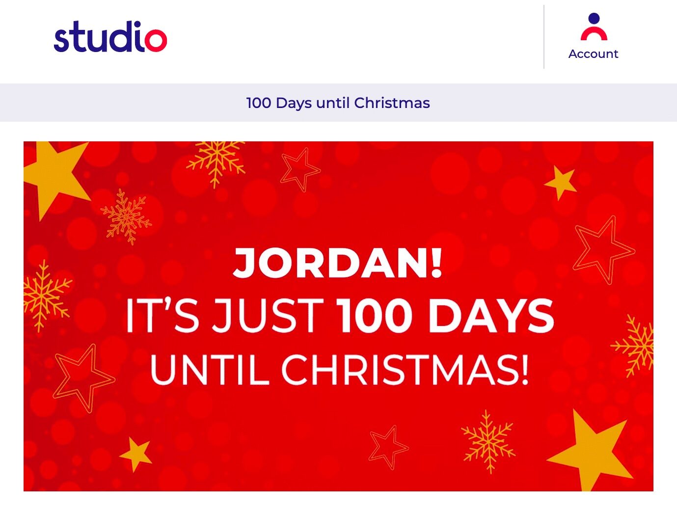
The online retailer Studio used a bright and bold countdown timer to alert recipients that there were only 100 days until Christmas. They also used their CRM feed to include the recipient’s name in the timer, too—a great example of personalization.
Can you use a subtle countdown timer?
Timers can be small, but mighty. This timer from Kate Spade, placed directly beneath the logo, is a lovely example of a small, punchy timer that captures attention.

Can you use a different shaped timer?
Timers don’t have to be linear, and they don’t have to tick. A simple days or hours to go roundel can work wonders and gets the message across just as effectively.
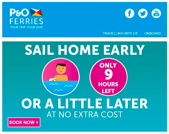
P&O Ferries used a roundel for their countdown timer to let customers know how long they had left to change their departure dates for no extra cost. Simple, yet very effective.
Can you use fun designs for countdown timers?
Whilst you can go wild with design, it’s best to stick to the simpler designs. If the design is too complex the timer can get lost amongst the chaos. Of course, some design elements to enhance the timer are great, and using custom fonts gives them some extra wow factor.
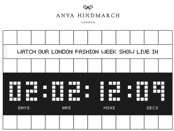
Anya Hindmarch used this awesome technical-looking font for a countdown to their London Fashion Week show. Even though the design is simple, using the custom font really makes the timer pop.
Can you include other forms of personalization with a timer?
If you want to really up the stakes, add other live functionality alongside the timer. Personalized images work super well to enhance the message, it shows the recipient that you value them as a customer.
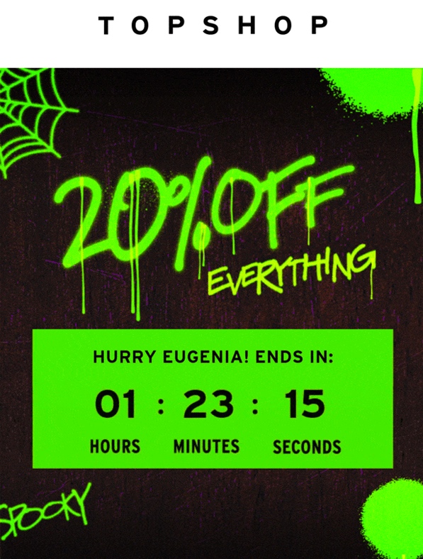
This timer from fashion retailer Topshop included the recipient’s name within the text of the countdown timer, creating that sense of personalization, as well as urgency to shop!
What happens when it’s over?
Just because it’s over, doesn’t mean it’s really over. There’s still opportunity for timers after they’ve hit zero! So many brands add a timer to an email and then let it run down to 00:00:00. If you open and it’s on zero, you think it’s all over and don’t engage. What you should do is swap out the timer with an after message so those long-tail opens get an option to engage. This gives you an opportunity to win back any late openers.
When this timer from Australian fashion retailer Johnny Bigg expired they replaced it with an after image. The zero timer was faded out and a “too late” message was overlaid, but they’ve included a win-back message to shop what’s left, still encouraging recipients to shop.

Time to try it yourself
Using countdown timers in email is an excellent way to drive urgency and engagement. By alerting recipients that there is only a certain time window for them to either shop the latest deals or order before an upcoming holiday, you are encouraging them to shop then and there, as nobody wants to miss out on a great offer!
 |
Kickdynamic’s Best Live Emails of 2021 Learn more about countdown timers and more personalization tools to enhance your customers’ email experience—with over 50 examples from leading brands. |
Source link


