 Source: The Basic Apple Guy
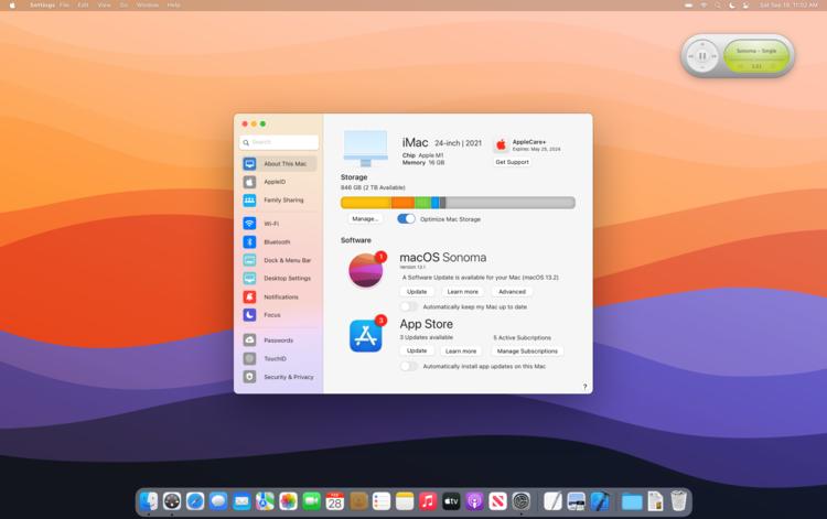
Apple’s macOS System Preferences app has been around a long time, but what if it was replaced with something more modern? That’s something one concept imagines with the Settings app on iPhone and iPad used as the inspiration.
This new concept was created by The Basic Apple Guy and shows us a world where the System Preferences app has been replaced by something called Settings, complete with the same icon that we’re familiar with on iOS 15 and iPadOS 15 as well as earlier releases. And yes, we get the same sidebar configuration, too. Making the Settings app a consistent experience across macOS, iOS, and iPadOS would surely help people who are new to the Mac after buying a gateway iPhone, something that shouldn’t be overlooked.
I’ll be the first to call out that my few mockups of System Preferences are just an initial take to address some of my frustrations with the application. It by no means solves all annoyances and may conceivably create more problems than it solves, but let us take a look at some initial reimaginings of a redesigned Settings app. I wanted the new Settings app to have coherence across all menu options. In its current incarnation, preferences like ‘General’ look and function very differently than a more recent preference like ‘Trackpad’ or an even newer window like ‘TouchID’ or ‘Apple ID’. A redesigned Settings app could modernize and simplify many legacy preferences with a fit and finish more at home to modern macOS.
The improvements extend into each individual setting, too. Bluetooth, for instance, can display images based on the devices that are connected — blue AirPods Max? You’ll see them on-screen, just as you should.
I’m a big fan of what’s going on here and I absolutely agree that it’s time that Apple gave the macOS preferences a refresh. You can see more screenshots and read about the reasoning behind them in the original blog post, too.
Source link


