


![]()
Our inboxes are always teeming with numerous travel emails and newsletters from all those amazing travel websites we once subscribed to. Of course, they never fail to inspire the wanderlust in us!
Email marketing can work wonders for the travel industry- that’s quite evident from the fact that travel emails have an open rate of 20.69%.
Email marketers from the travel industry often burn the midnight oil and design attractive emails and newsletters to woo their subscribers.
But what is it that will make your travel emails stand out from the crowd?
Email Uplers has mined these travel email marketing template examples from the best names in the travel industry and conducted an email design audit to give you a definitive idea of what you should and should not do. Travel email marketing might be a tough nut to crack, but these inspirations will definitely make it easier for you.
1. Carnival

On the mark:
- There is a pre-header text, which helps in increasing open rate.
- ‘Today’s Deals’, ‘Join the VIFP Club’, and ‘My Benefits’ are the sections that generate user interest.
- It is visually appealing
- The header text entices the subscriber to scroll through the entire email.
- The GIF at the bottom captures the subscriber’s attention, prompting them to click through the email.
- The CTAs are strategically placed, with an interesting copy.
Off the mark:
- The image-based template won’t appear as appealing with images turned off.
- The length of the email may be a deterrent for the email metrics.

2. MedExpress

On the mark
- The first scroll displays all the essential information.
- There is a perfect balance of information and sales in the email copy.
- The primary CTA is extremely prominent.
- The email has a single column layout which promotes accessibility.
Off the mark
- The email is a touch too heavy on text.
- The list of the ultimate travel essentials could have been portrayed using illustrations to make them more interesting to consume.
3. Eurostar
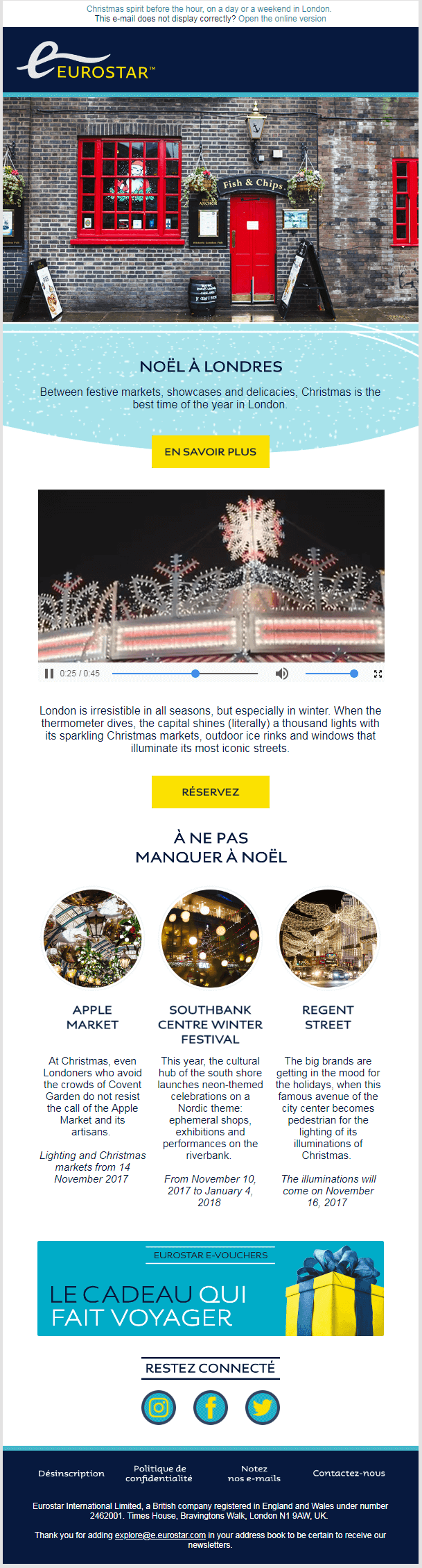
On the mark
- It follows the email design best practices like including preheader text, social sharing buttons, “Unsubscribe” link and “View Online” link.
- The beautiful hero image makes the subscriber curious to scroll through the entire email.
- Video in the email helps in getting better clicks.
- Text to image ratio is properly maintained.
Off the mark
- Video is not supported in all email clients.
- Language may be a barrier for subscribers who are not able to comprehend French.

4. Greatist
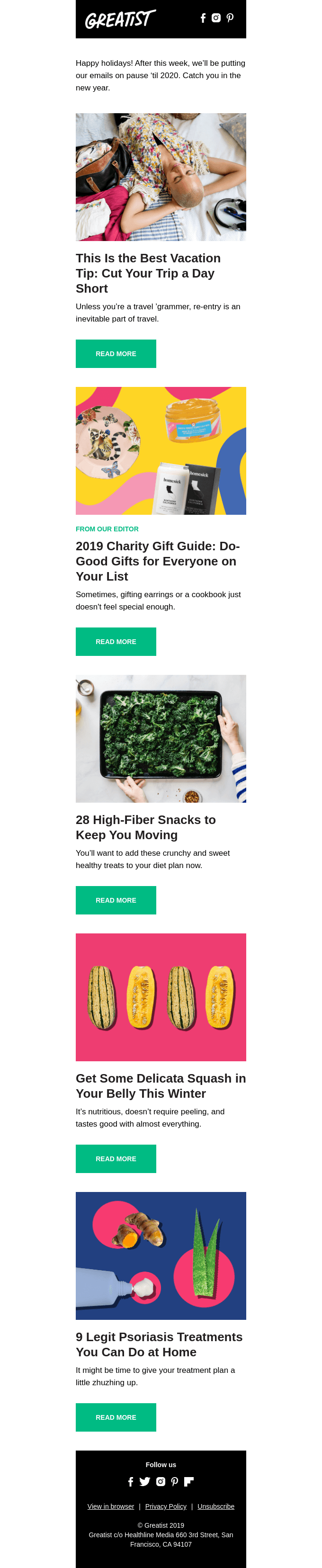
On the mark
- Excellent balance of text and visuals
- Smart use of white space
- The images and copy are relevant to each other.
Off the mark
- Absence of a primary CTA button.

5. The Ultimate

On the mark:
- The first scroll clearly conveys the travel message.
- It is good to have important links used as navigation.
- The height of the email is perfect.
Off the mark:
- Pre-header, web version, and can-spam footer are not used (This might be coming through ESP when delivered).
- Text link styling doesn’t match the design.
- There is no highlighted CTA in the copy.
6. AWAY
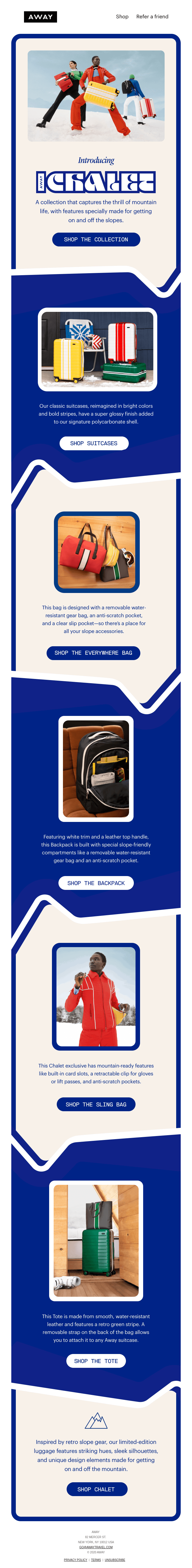
On the mark:
- You get a hang of the message and offer in the first scroll itself.
- The email layout is extremely visually enticing.
- Each segment in the email has a separate CTA.
Off the mark:
- Pre-header, view web version, and can-spam footer are not used (This might be coming through ESP when delivered).
- Social media links are missing.
7. Hipmunk

On the mark:
- The character in the email maintains the brand look throughout the design.
- The first scroll conveys the service of the Company.
- The CTA and option to download the apps for Android and IOS are aptly highlighted.
Off the mark:
- Pre-header, web version and can-spam footer are not used (might be coming through ESP when delivered).
8. VRBO
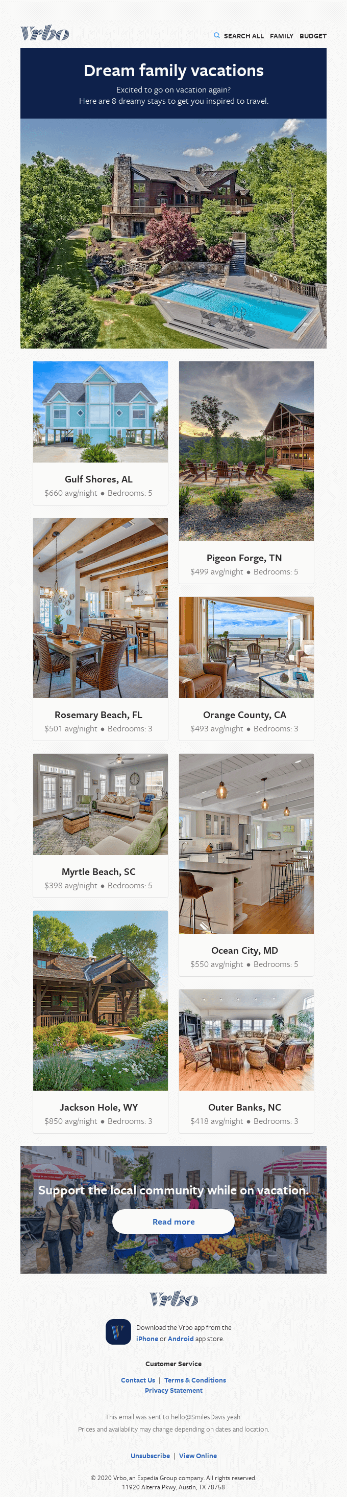
On the mark:
- Heavy on visuals, which makes the email very engaging.
- The most important details about the listings- number of bedrooms and the average cost per night- have been mentioned in the email itself; this way the reader can arrive at a decision without having to visit the website.
Off the mark:
- The CTA is unrelated to the primary content of the email.
- Social media links are missing.

9. Nassau Paradise Island
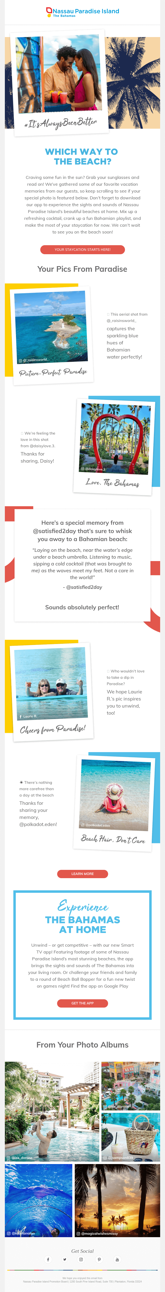
On the mark:
- Captivating hero image.
- Good use of white space.
- Good balance of text and visuals.
Off the mark:
- Given that the email revolves around people’s travel memories, apart from images, videos could also have been included to make it further captivating.
- Some parts do not have web-safe fonts; if taken as images, these might not load properly if the email client at the subscriber’s end blocks images.
10. Virgin Holidays

On the mark:
- Logo and sender information has been provided.
- Personalization and CTA like “Follow your dreams” helps to connect with subscriber.
- Social icons are provided.
- “See the email in full” link in the header in case the images do not load.
- “Find us” link provides information regarding physical stores.
Off the mark:
- Depends heavily on whether the subscriber clicks through to the website.
11. Airbnb
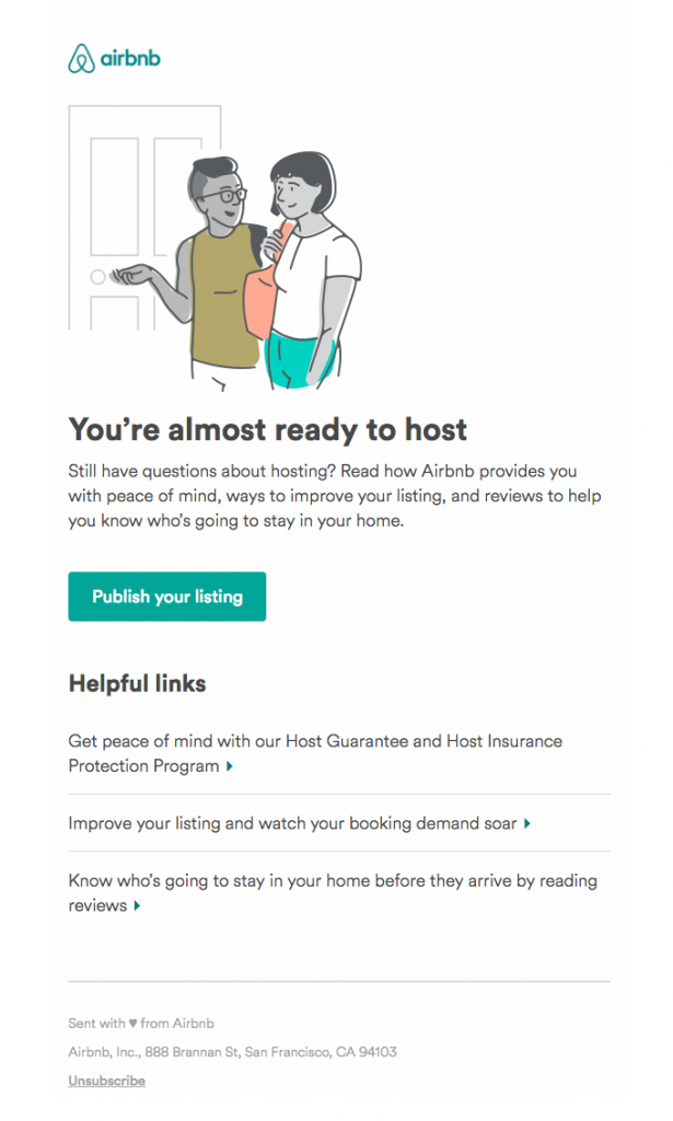
On the mark:
- Logo is at the top, in the header.
- It’s a short email with a single CTA.
- An interesting illustration that matches the purpose of the email.
- Unsubscribe link provided.
Off the mark:
- No pre-header text, no link to view the email in browser, no social icons.
12. Outdoorsy
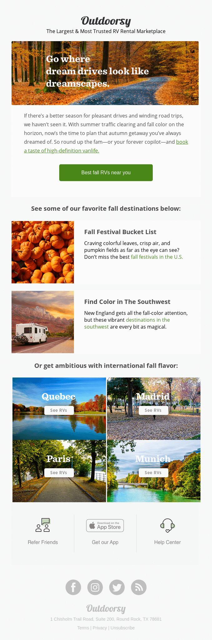
On the mark:
- There are hyperlinked text segments throughout the email- this improves the click-through rate.
- Font styling is consistent – easy on the eye.
- Social icons included.
- Icons for downloading the app, referring friends, and seeking support are also included.
Off the mark:
- The images used are small and have text overlaid on them. As a result, there’s not enough visual content in the email for the subscribers to remain engaged.
Wrapping It Up
With these travel templates and travel email examples, we’re sure that your creative juices are now in full flow. Now is the era of super personalization and for that, you need to focus on customer context and needs in real-time. Email Uplers believes that while plain text emails are still effective, travel email marketing should now dive into interactivity to make travel templates more creative and captivating. It is time to amaze your subscribers with mailable microsites.
Source link