On-point product marketing is why Webflow was able to enter the no-code website market with competitors like Wix and Squarespace and still generate 4 million monthly users. Brands like Webflow, Drift, and Close prove you can grow and succeed in a completely saturated market.
With everyone else seeking to beat out the competition, you need to find a way to do it differently, better.
Product marketers lead the business to where they need to play in order to win.
In this article, we’ll break down seven product marketing examples from brands that put their audience first and communicate value to stand out from the competition. You’ll learn why they work, with key takeaways to inspire your marketing efforts.
1. HEY
To grab attention and pique interest, show potential customers the value you provide on the first impression. Use this to sell visitors on why your product is right for them.
Basecamp’s email startup HEY does this well. It targets people’s pain points around using email and positions the company as their savior.
The brand also picks up on the very corporate feel of other email providers and takes a sharp turn in the other direction to give users a breath of fresh air.
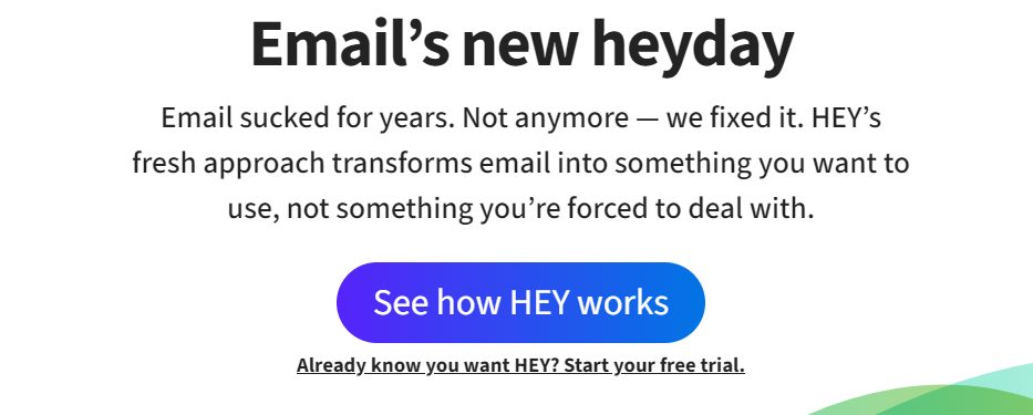
HEY demonstrates its positioning in the messaging on its website. Its homepage is a masterclass in compelling copy, starting with the headline:
David Ogilvy, the father of modern advertising, believed headlines were the most important part of the copy. Many users will only ever read your headline. Use it to clearly communicate your value.
HEY’s headline sets the tone. But it’s more than a clever play on words (“Email’s new heyday”). It’s a bold statement that echoes their beliefs: “Email sucked for years. Not anymore – we fixed it.”
It also does what every compelling headline should: be relatable. Many share the opinion of Basecamp founder and CEO Jason Fried when he says email is no longer exciting:
“The last time I think anyone was really excited about email was like 16 years ago, when Gmail launched.
“Not much has changed since then. … We’re trying to bring some new philosophical points of view.” [via Verge]
Professor of communications at the University of Buffalo in New York shared his thoughts with the BBC on why people no longer enjoy email:
“Many people dread email because it is a conduit for unwanted advertising, a wide range of spam, and flat-out attempts to scam or ‘phish’ us. It’s generally impersonal and work-related.”
In three sentences, HEY taps into this problem and positions itself as the solution. The final sentence of intro copy works to push readers to find out more.
“HEY’s fresh approach transforms email into something you want to use, not something you’re forced to deal with.” What is that approach? You’ll have to click the call-to-action to find out.
Further down is a letter from Jason Fried on why HEY exists:
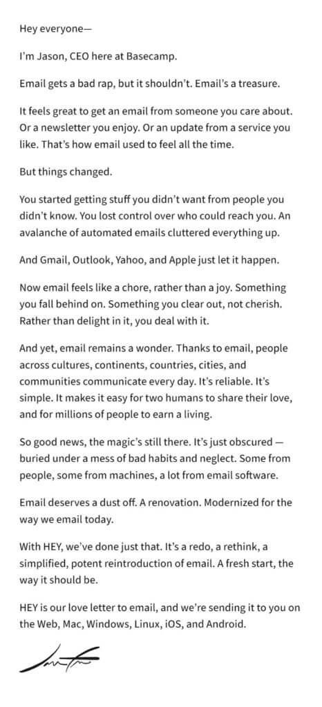
It follows the classic copywriting PAS (Problem, Agitate, Solution) formula:
- Problem. “You started getting stuff you didn’t want from people you didn’t know. You lost control over who could reach you.”
- Agitate. “Now email feels like a chore, rather than a joy. Something you fall behind on. Something you clear out, not cherish.”
- Solution. “Email deserves a dust off. A renovation. Modernized for the way we email today. With HEY, we’ve done just that. It’s a redo, a rethink, a simplified, potent reintroduction of email.”
HEY focuses on these problems and turns it into persuasive copy.
The letter also separates HEY from other email clients by adding a personal touch and background story.
Research from Sprout Social shows that people feel more connected to brands when they see executives engaging on social media.
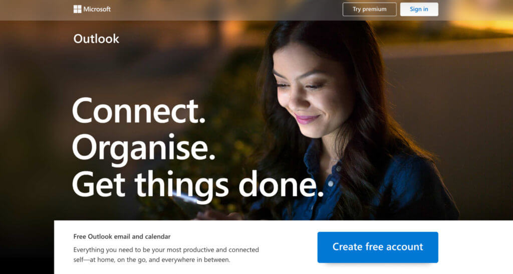
HEY comes across as a company that cares about its users. In comparison, competitors seem more corporate and impersonal.
Like Outlook:
Or Zoho Mail:
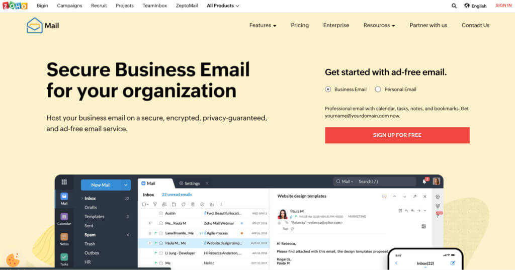
Unlike Outlook and Zoho, HEY’s copy is backed by social proof from real users, with links to their social media profiles:
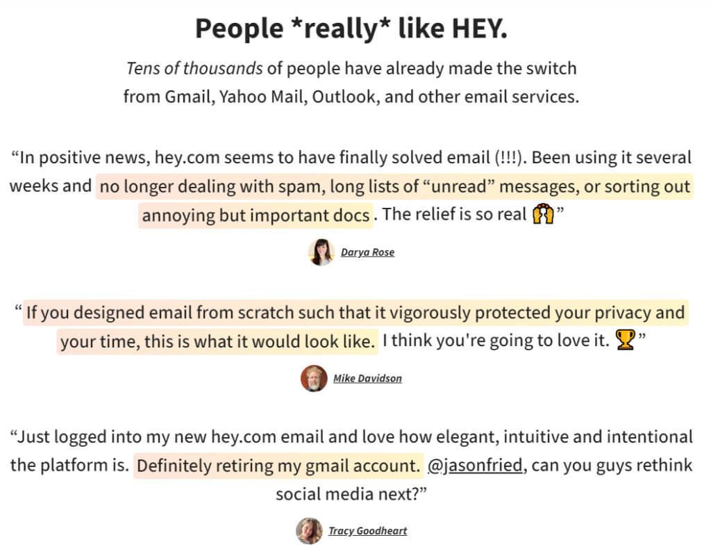
This delivers a “don’t take our word for it” message that instills confidence in the reader.
Your messaging must communicate the problem you solve for users. Use product marketing to find your customers’ pain points and make them the central element of your message.
2. HubSpot
According to a survey by Twilio, nine out of 10 consumers say they would like a messaging contact option. And nearly two-thirds of customers who engage via a chat platform are more likely to return to a website and repurchase.
HubSpot’s product marketing is a great example of reducing friction in the buying process.
Its HubBot chatbot helps marketers customize their site experience so users can find information without having to speak to sales.
HubSpot’s chatbot sits in the corner of the homepage. It’s only there to assist users who require help. Unlike live chat or phone support, it’s always on, allowing HubSpot to assist customers 24/7.
When users click on the message icon, they’re asked a question and given several possible answers.
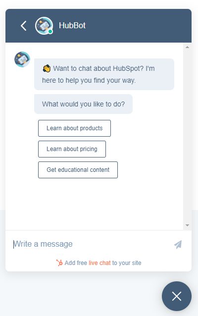
Their selection ensures they get the most relevant content they need. This reduces the risk of users getting lost or navigating away from the HubSpot website.
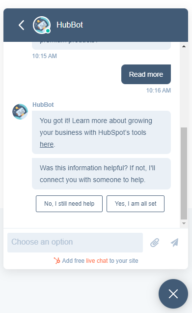
It also reduces friction and prevents users from jumping through hoops (e.g., filling out forms) to find what they need. This helps to shorten the sales cycle and progress leads through the funnel.
By implementing a chatbot, HubSpot has turned the B2B buying process into a more authentic experience—one that aligns with how customers communicate every day through messaging apps.
It’s nailed the essence of what creative product marketing is about: finding unique ways to identify and solve customer problems.
3. Bellroy
Ecommerce wallet brand Bellroy is an example of how to overcome the problem of customers not getting hands-on with a new product before buying online.
It uses close-up videos to detail every aspect of its wallets from different angles.
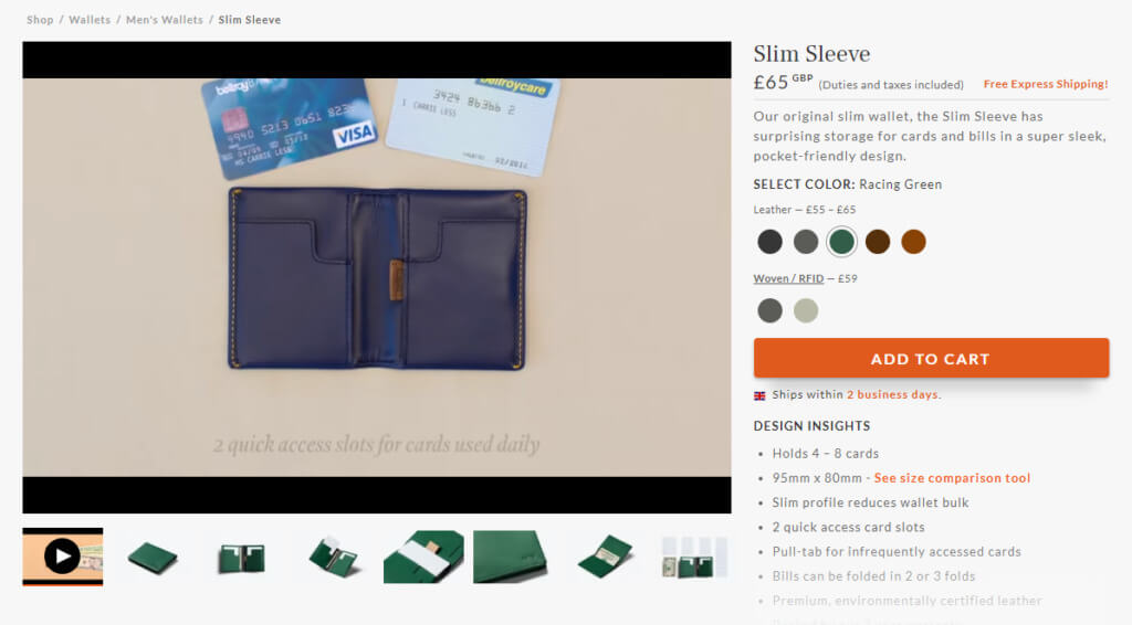
It also includes high-res images highlighting product features and how many cards, coins, and notes customers can fit into the wallet.

Bellroy also understands an important customer pain point: fitting a full wallet into a typical pocket.
Bellroy’s target audience is mostly male, who tend to carry wallets in a trouser pocket. The bulkier a wallet becomes, the harder it is to get in and out of a pocket. Trousers also become more uncomfortable.
To differentiate its product from others, Bellroy uses a clever comparison tool.
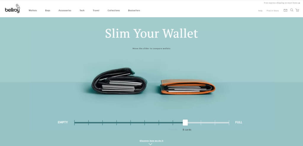
Users can adjust the slider to select the number of cards they carry and see how Bellroy’s wallets stay slim.
The same page also details how Bellroy makes its wallets stay less bulky. This highlights a key selling point while hinting at competitors’ flaws.
To improve the buying experience further, they offer recommendations for customers based on what they carry in their wallets.
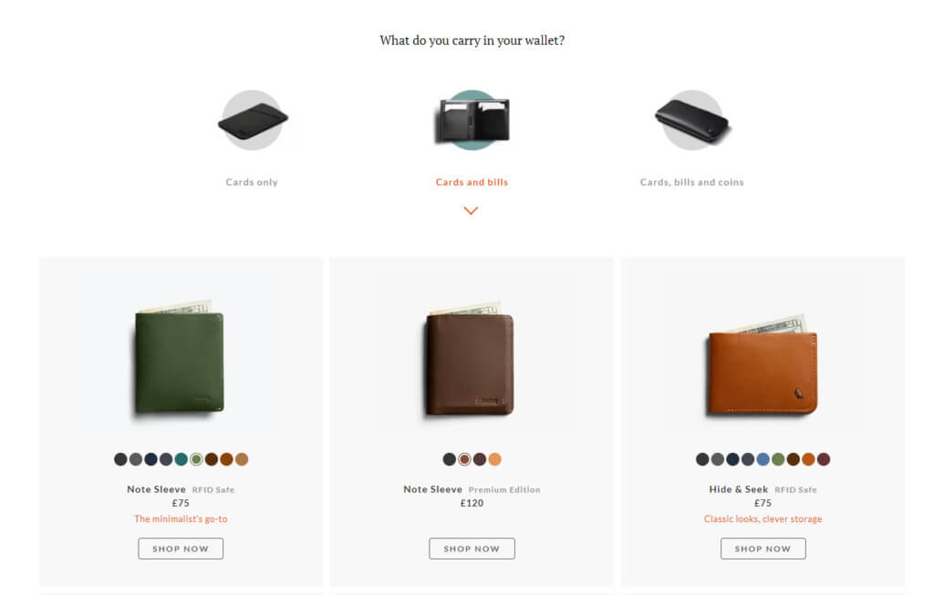
Bellroy’s product marketing does three things well:
1. Shows its value proposition. Bellroy doesn’t rely on its “Slim your wallet” tagline for differentiation. It demonstrates its promise of value with an interactive experience.
2. Personalizes the experience. Its comparison tool and product recommendations ensure customers get the best product for their needs.
3. Answers customer questions before they ask. From how they manufacture wallets to their features and storage, Bellroy gives customers everything they need to make an informed decision.
These qualities are achieved through research.
Survey existing and potential customers to build robust buyer personas. Conduct competitive analysis.
Unearth your promise and use it to formulate a product positioning and messaging strategy that sells your product as the most beneficial.
4. Webflow
Webflow is a successful example of carving out a new category within competitive markets.
As a no-code website builder, Webflow is up against strong competition from platforms like WordPress, Squarespace, and Wix.
Despite entering the market long after these platforms were established, Webflow has grown to more than four million monthly visitors, over 45,000 paying customers, and over $20 million in annual recurring revenue.
How? With clear target customers.
Where Wix targets designers and agencies, and Squarespace targets small businesses and companies, Webflow found its product-market fit by focusing on the gap between designers and developers.
Webflow CTO Bryant Chou talked about the company’s ideal customer in an interview with Salesflare:
“That customer persona, for us, is a freelance web designer. And that freelance web designer is the lowest common denominator. That person needs everything. That person needs hosting, that person needs design flexibility, that person needs symbols, interactions, multiple pages. They need a CMS.”
Much of Webflow’s product marketing is designed around making its platform the best choice for freelance designers.
Topics on its blog center around freelancing, web design, inspiration, tutorials, design process, and entrepreneurship.
It also provides ebooks related to freelancing and design and offers Webflow University courses on “The Freelancer’s Journey” and creating custom portfolios.
This content helps keep Webflow front of mind when a user is making a buying decision. It also puts the company in a position to target different customer profiles. As Bryant explained on the WorkOS podcast:
“We started to realize that these freelancers, these designers, would go on to find jobs at larger companies. These larger companies would have the same exact need of building a bespoke professional website. And Webflow was the best possible choice for these companies.”
This helped Webflow evolve from a content library frequented by designers into a community that includes marketers and creatives.
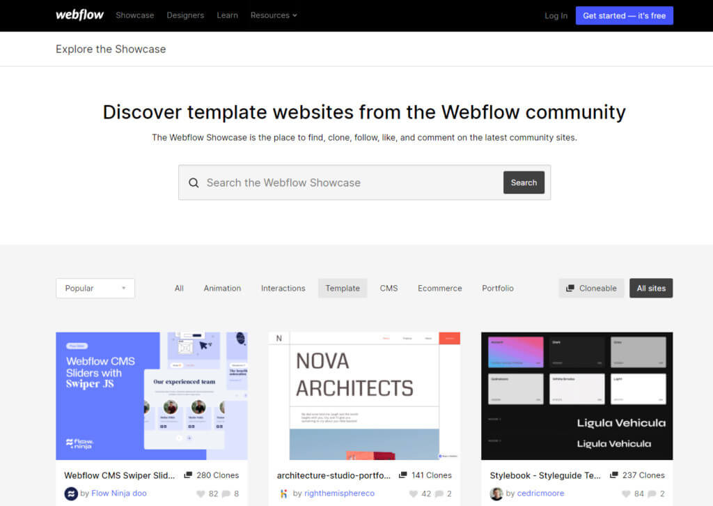
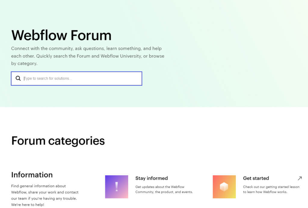
Webflow offers several ways for community members to interact with each other (without necessarily interacting with the brand).
Its Website Showcase lets Webflow designers share their work:
A forum lets users ask questions, receive feedback, and chat with other users:
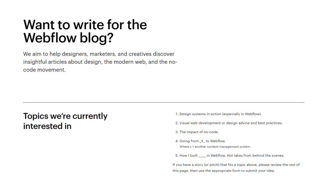
Its blog encourages content from the community:
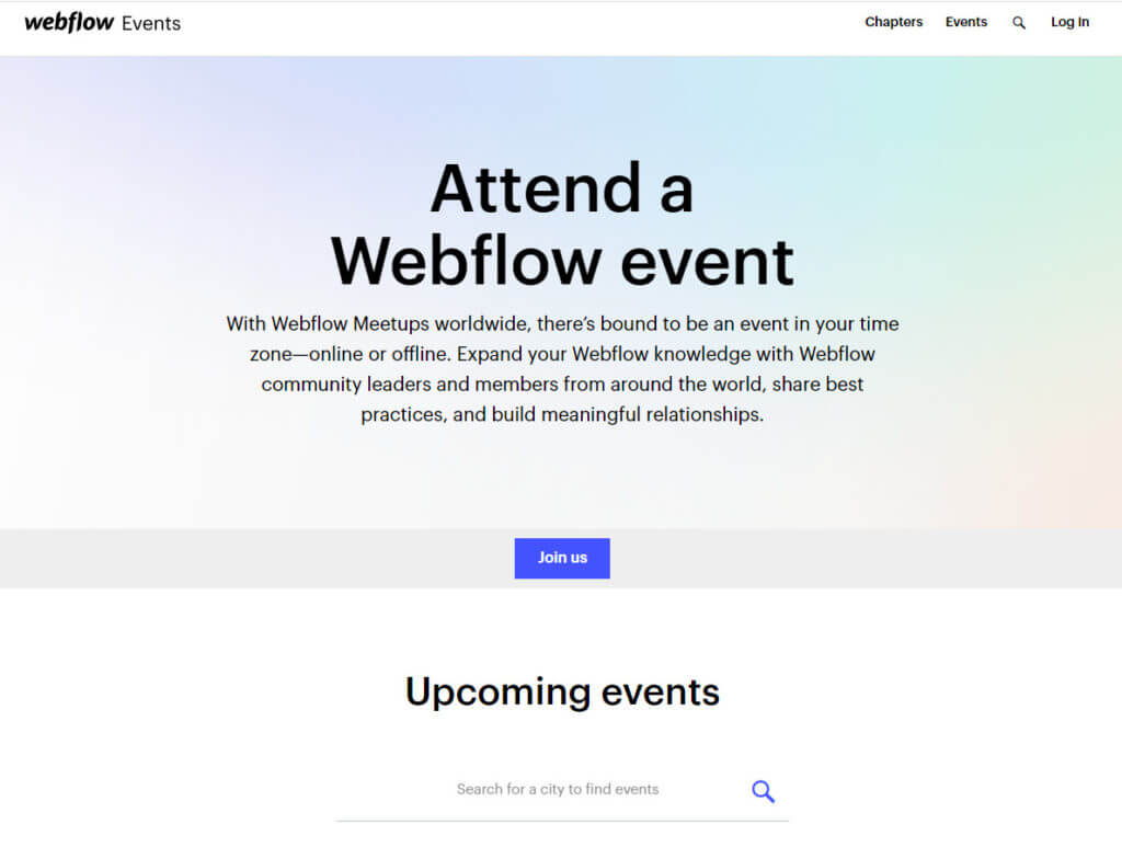
And its events bring the community together while positioning Webflow team members as thought leaders:
This gives Webflow masses of user-generated content, saving time and money marketing the product while allowing the community to sell the benefits.
Running a community also helps with customer retention and product development. Research from Vanilla Forums shows:
- 58% of online communities say that their customers are more loyal to the brand because of their community;
- 78% of brands credit communities for helping to develop new and future products;
- 84% of branded communities say that the community has had a positive impact on those interested in the brand;
- 88% of branded communities said that the community has helped improve customer experience.
Use product marketing to teach your audience how to get the most from your product. Encourage them to share their knowledge to keep your product relevant.
5. Spendesk
Around 63% of customers surveyed by Wyzowl said they consider onboarding programs when making a purchase decision. Yet it’s an area where many companies fall short.
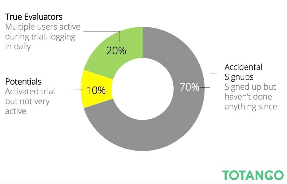
An onboarding program that shows new customers how to get the most from a product is critical for SaaS products, where a significant number of trial users never activate.
Spend management platform Spendesk tackles this issue with a seven-step onboarding tour built using product engagement tool Chameleon.
From the start, Spendesk encourages users to take the tour by clearly describing what it helps them do.
Letting them know they can skip and restart the tour also reduces any hesitancy a user may have around how much time it will take.
The first features the tour presents help users orientate themselves. By focusing on completing a request task mentioned at the start, Spendesk immediately follows through on a promised benefit.
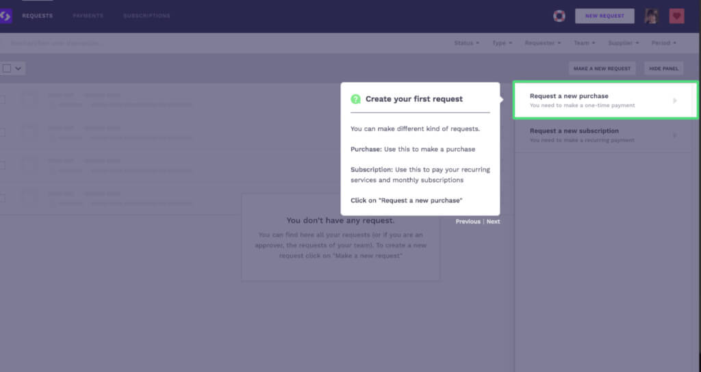
By clearly demonstrating how to perform each task and communicating the product’s simplicity, users are guided to the “aha” moment, where they can see the value of the product.
The tour ends with a clear call to action that helps users take the next step, as well as instructions on what to do if they need help.
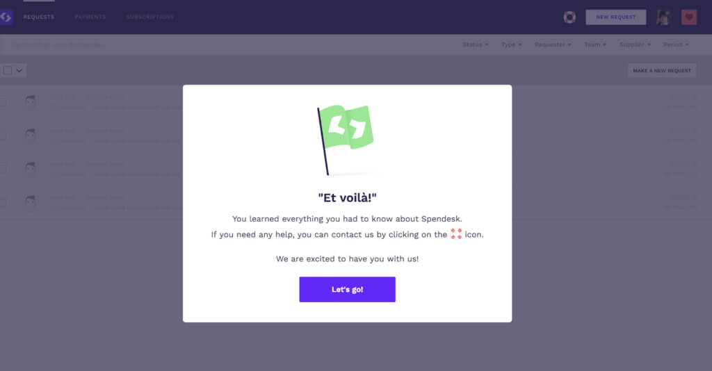
In seven onboarding steps, Spendesk sells the benefits of its product. It teaches and activates users, encouraging sign-ups and reducing churn.
Use onboarding to sell the long-term value of your product by showing how it can make life easier.
As UserOnboard founder Samuel Hulick says:
“Onboarding is not so much about making a positive initial introduction as it is an overarching approach to helping your customers become better versions of themselves.”
6. Drift
Drift entered the live chat market in 2015, long after the tool had been established by other players.
Instead of trying to compete with competitors’ chat features, the platform did something else: it invented a new category.
“Conversational marketing” is a new take on website chat widgets, whether that’s live or via a chatbot. Using this new marketing philosophy, Drift dug itself out of a crowded market for “customer communication” and into a niche where Drift was the first to arrive.
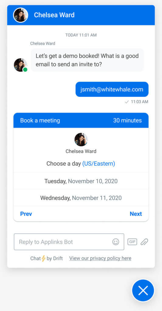
Early on, Drift learned that everyone with a similar tool was targeting customer support teams. So, the company leveraged their unique positioning and messaging to target a new audience: sales and marketing teams.
It was a relatively new concept for sales and marketing—so new that no one knew how to talk about it.
Dave Gerhardt, Drift’s Former Head of Brand, told Leedfeeder:
“People started to talk about [Drift] as ‘chat for sales, sales chat, marketing chat …’ and we started to talk about it in that way. But it didn’t really take off until we gave it a name.”
Ultimately, Drift used voice of customer research to nail down the name for their new niche (“conversational marketing”).
Communicating about your product the way the customer communicates about it offers the shortest route to understanding.
Take notes and keep a file of things people say about your product. Use it for inspiration, in your copy, naming new products, etc.
7. Close
CRM software Close is an example of doing one thing well. The company’s product marketing efforts center on one channel: content.
It’s the sole reason for a two-person team growing into a company with $6+ million in annual revenue.
In a blog post, Close founder Steli Efti explains why they chose to focus on content marketing:
“Out-teaching your competition is one of the best ways to build your brand, especially in the SaaS world. If you teach people how to run their businesses more effectively, they’ll look to you first as they search for software solutions.”
Close’s content marketing machine is built around three main functions:
- Generate tons of raw material;
- Send that raw material down an assembly line;
- Remix and repurpose content for multiple uses.
The team focuses heavily on educating prospects and customers. The library of raw material it creates is available for free in a huge library of resources, downloadable guides, and a newsletter with over 400,000 subscribers covering topics relevant to sales and sales reps.
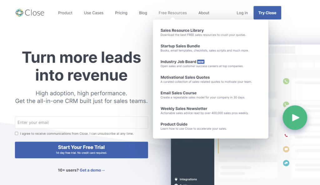
The company also produces fresh blog content every week around various sales topics:
- Sales process;
- Sales teams and management;
- Sales calling;
- Sales emails;
- Sales SMS;
- Sales guides;
- Sales brief;
- Company news.
They then repurpose this content to reach audiences on different channels.
This post on pivoting from SaaS to startup sales consulting, for example, is also available to listen to as a podcast:
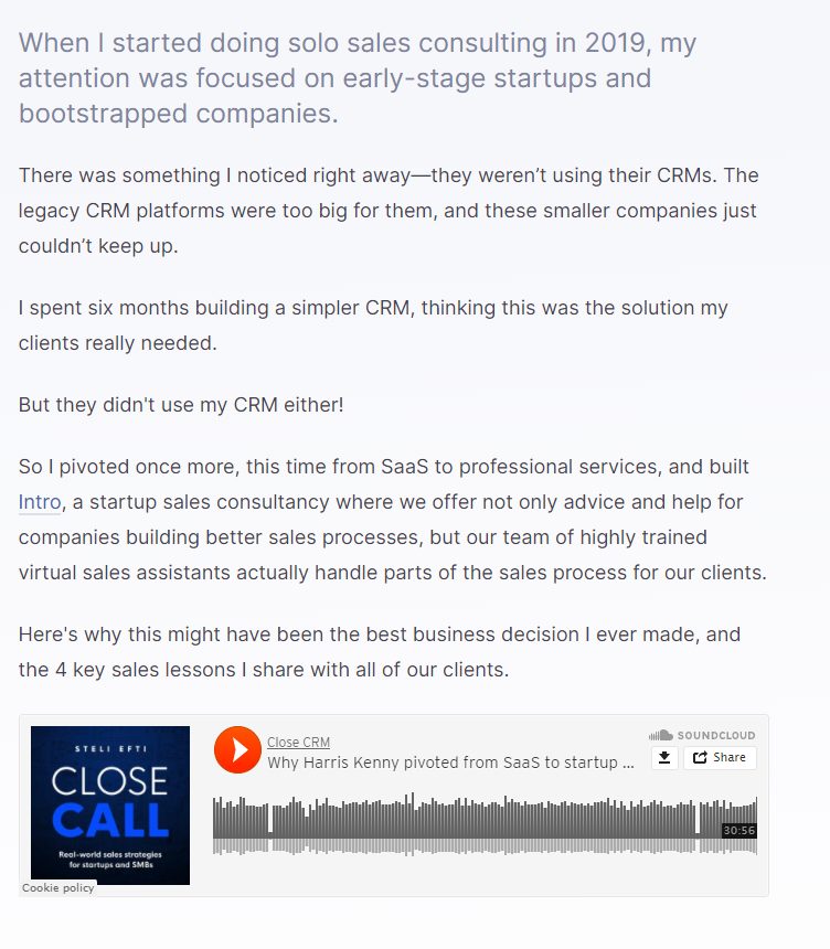
In this video on sales objection, Steli gives his tips for handling prospects and selling your product point of view:

They’ve turned this same content into a blog post:
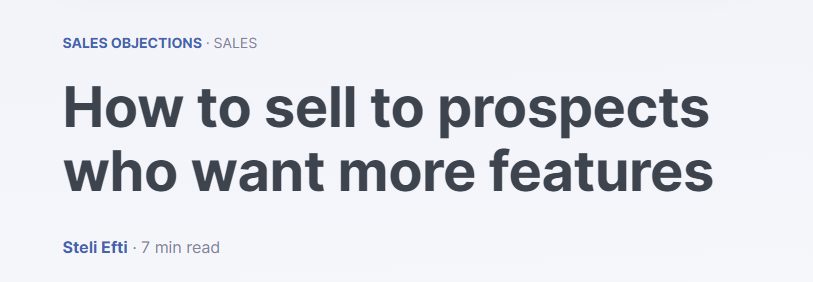
People prefer to learn in different ways. Some verbally, some visually, some through reading. Repurposing lets them consume content in ways that suit them.
In his blog post, Steli explains how repurposing was born out of a desire to improve efficiency. After initially recording blog posts for marketer Ramin Assemi to write, Steli realized more could be done with the content:
“At some point I realized, ‘If I just stop saying ‘the blog post’ in the recording, and I stop referring specifically to Ramin, we could also use this raw material for a podcast or something.’
And then I realized, ‘Shit, if I just use a webcam, I could have video, audio, and a blog post.’
So that’s exactly what we did. We created three forms of content simply by recording one video.”
Close’s product marketing highlights the importance of competitor research and playing to your strengths.
The company knew from the time of its product launch that it couldn’t compete with the ad budgets of its rivals. It also knew from reading competitors’ blogs that it could do better. So it focused its go-to-market strategy on where it knew it could win.
“Every week, I receive emails from people thanking me for a specific tactic or piece of advice. Some of them even set growth milestones around becoming a Close customer.
“Founders, sales directors, and sales reps love our content so much that they’re counting down the days to purchase our product. That’s some powerful stuff. Because we’ve helped them every step of the way—whether they’re launching startups, building sales teams, or chasing down sales goals—they know exactly who to trust when they’re ready for an inside sales CRM.” – Steli Efti [via Close]
A key element of product marketing is trust. People don’t hand over money without trusting that your product will give them value.
Create genuinely helpful content without expecting anything in return. Extend a trusting hand at the most important time—before customers consider their options.
Conclusion
Don’t create a product marketing plan that competes with what established rivals do well. Win in your niche with unique positioning and messaging.
As advertising icon Bill Bernbach once said: “It may well be that creativity is the last unfair advantage we’re legally allowed to take over our competitors.”
Each of the examples in this article are companies that have used marketing to stand out. Use them to fuel the creative process for your product marketing and product management teams.
Start with market research. What gap can you exploit? Where are you stronger than the competition? Take time to understand your customers. What problems do they have? What are their expectations of your product?
Build a creative product marketing plan off the answers to these questions.
Master the strategies, skills, and mindset needed to stand out in even the most saturated markets in our Product Marketing Minidegree.
Source link


