A visitor lands on your site. Browses around. Leaves. It happens all the time. But if you aren’t getting conversions, you’re leaving money on the table. And it’s frustrating…
How can you possibly get people to stick around? And more importantly, what can you do to turn those one-time visitors into lasting customers? The answer: opt-in pages.
We’ll walk you through what opt-in pages are and why they’re so effective. We’ll also give you some examples to help inspire your own opt-in pages so you can bump up your conversions.
What is an Opt-In Page?
An opt-in page is a landing page that asks visitors to provide their contact information in exchange for something of value. This could be anything from a free eBook to exclusive access to a webinar or even discounts on future purchases.
Opt-in pages are important because they allow you to capture the attention of potential leads. When someone provides their contact information, you can add them to your email list and market to them in the future.
This usually marks the beginning of a relationship between you and the lead—and you’ll need to build on that relationship by providing valuable content on the regular.
Essential Features of an Opt-In Page
An opt-in page needs to be well-built if you want it to convert visitors into leads. Here are some must-have features to keep in mind:
Value proposition: Your opt-in page should explain what the visitor will get in return for providing their contact information. This could be free content, a discount on a product, or some other type of incentive. The more value you can offer, the more likely someone is to provide their contact information.
Lead form: The lead form asks for someone’s contact information. You should make this as easy as possible to fill out, and avoid asking for too much information at once—the more you ask for, the more likely the user is to bounce.
Call to action: The call to action is the button or link that encourages visitors to submit their information in exchange for something of value. You want it to be distinct from the rest of your page so it stands out to visitors. Plus, you should include a strong directive, such as “download now.”
5 Examples of Opt-In Pages
Now that you know what an opt-in page is and what it needs to be effective, it’s time to look at some real-world examples. Here are five pages that do a great job of enticing visitors.
1. Nomadic Matt’s Pop-up Opt-In Page
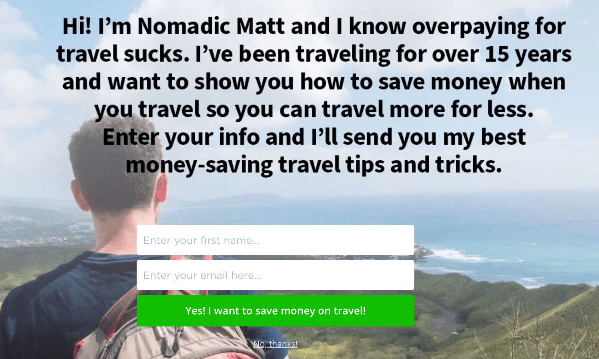
Nomadic Matt is a travel blogger who knows the importance of building an email list. His pop-up opt-in page introduces himself, then asks for your name and email to get money-saving travel tips.
What works:
- Matt’s intro is friendly and casual to show off his style. He tells you he knows that “overpaying for travel sucks” and he can show how “you can travel more for less.”
- The opt-in incentive (money-saving travel tips) is relevant to Matt’s target audience (globetrotters).
- The CTA copy (“Yes! I want to save money on travel!”) makes it easy for people to feel on board. Note the small faint copy for rejecting the offer that subtly nudges people towards the CTA.
2. HubSpot’s “Inbound Marketing Course” Opt-In Page
HubSpot offers an inbound marketing certification program that companies use as a training tool for their employees.
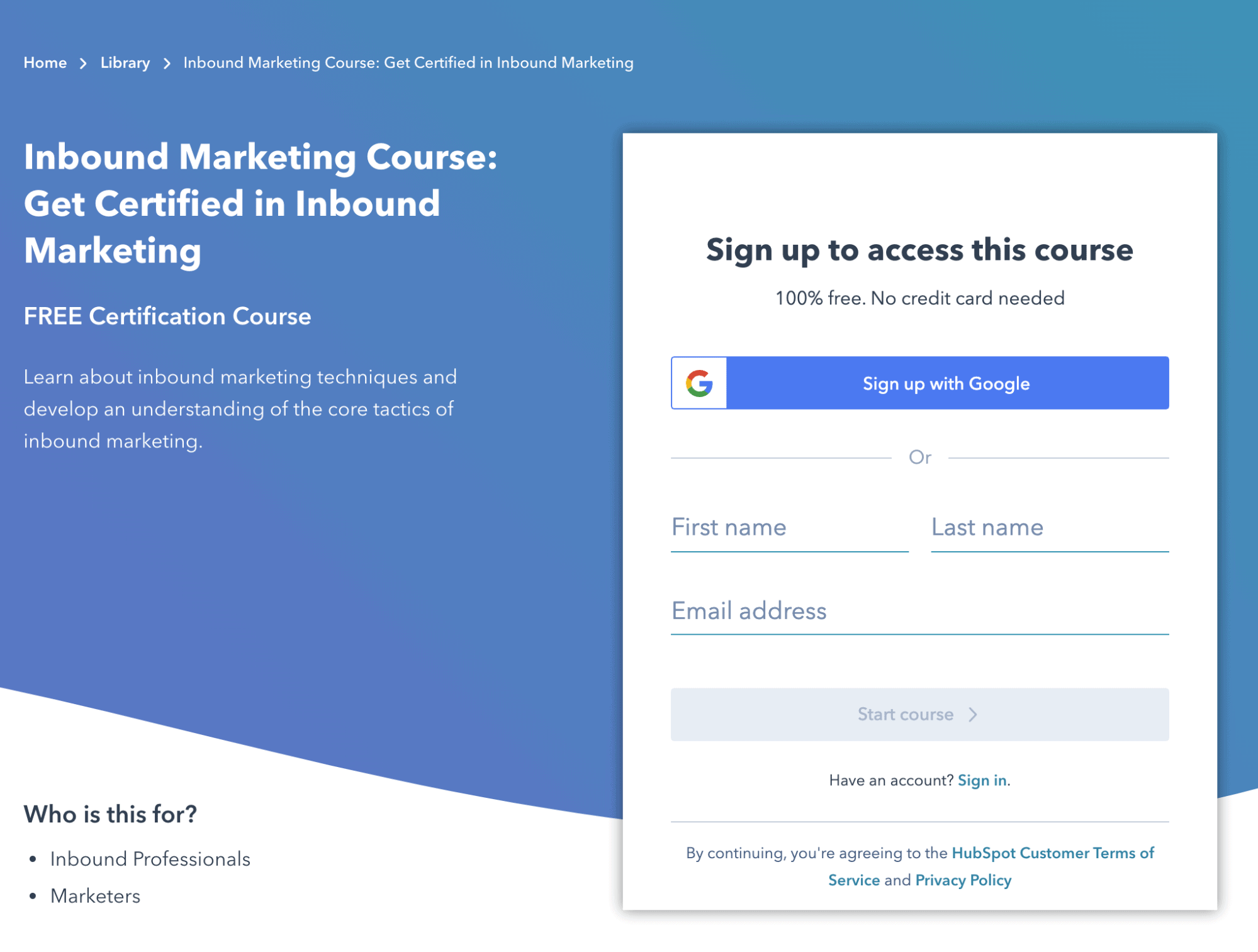
What works:
- The lead form is short and sweet, and it only asks for the basics—name and email address. Plus, it also gives the visitor the option to easily sign up via Gmail.
- The fact that the course is free is prominently displayed (a big incentive).
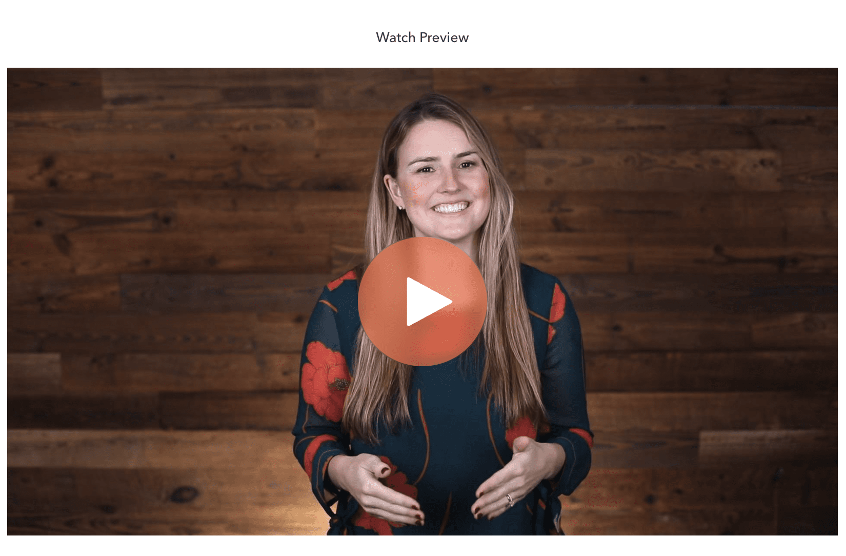
- The page also features a video below the lead form that introduces the program and how it can help employees learn inbound marketing skills. Note that while a video can give useful information, it does not necessarily boost conversions.
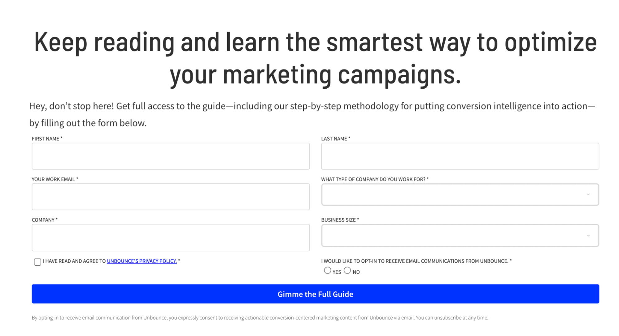
3. Unbounce’s “The Conversion Intelligence Guide to Optimization” Opt-In Page
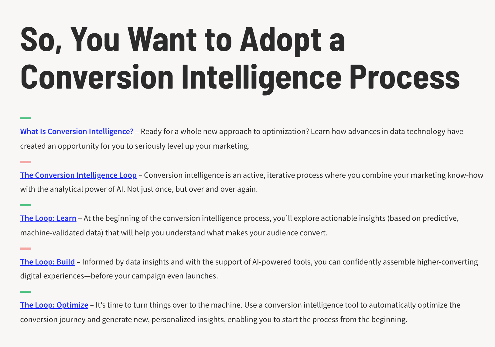
The Conversion Intelligence Guide to Optimization teaches you how to improve your website’s conversion rate in today’s competitive online market.
What works:
- The page gives a detailed overview of the sections in the guide, along with a good description of each part. This way, visitors know exactly what they’re getting into.
- The headline “Keep reading and learn the smartest way to optimize your marketing campaigns” encourages readers to dive in and learn more.
- The CTA button copy (“Gimme the Full Guide”) is straightforward, yet attention-grabbing, too.
4. Uberflip’s “Data-Driven Content Marketing” eBook Opt-In Page
The content marketing platform Uberflip helps users create, curate, and publish content. Here they offer a free eBook on collecting data to improve your content marketing:

What works:
- The opt-in page is centered in the middle of the screen, making it easy to see and focus on.
- The lead form box does not expand until your mouse clicks on the single form field displayed (work email), which makes the opt-in form appear seemingly less involved.
- The page highlights three concise points you can expect to learn from the eBook.
5. Rival IQ’s “2022 Instagram Stories Benchmark Report” Opt-In Page
Rival IQ offers a free benchmark report on useful Instagram Stories metrics collected from hundreds of brands.
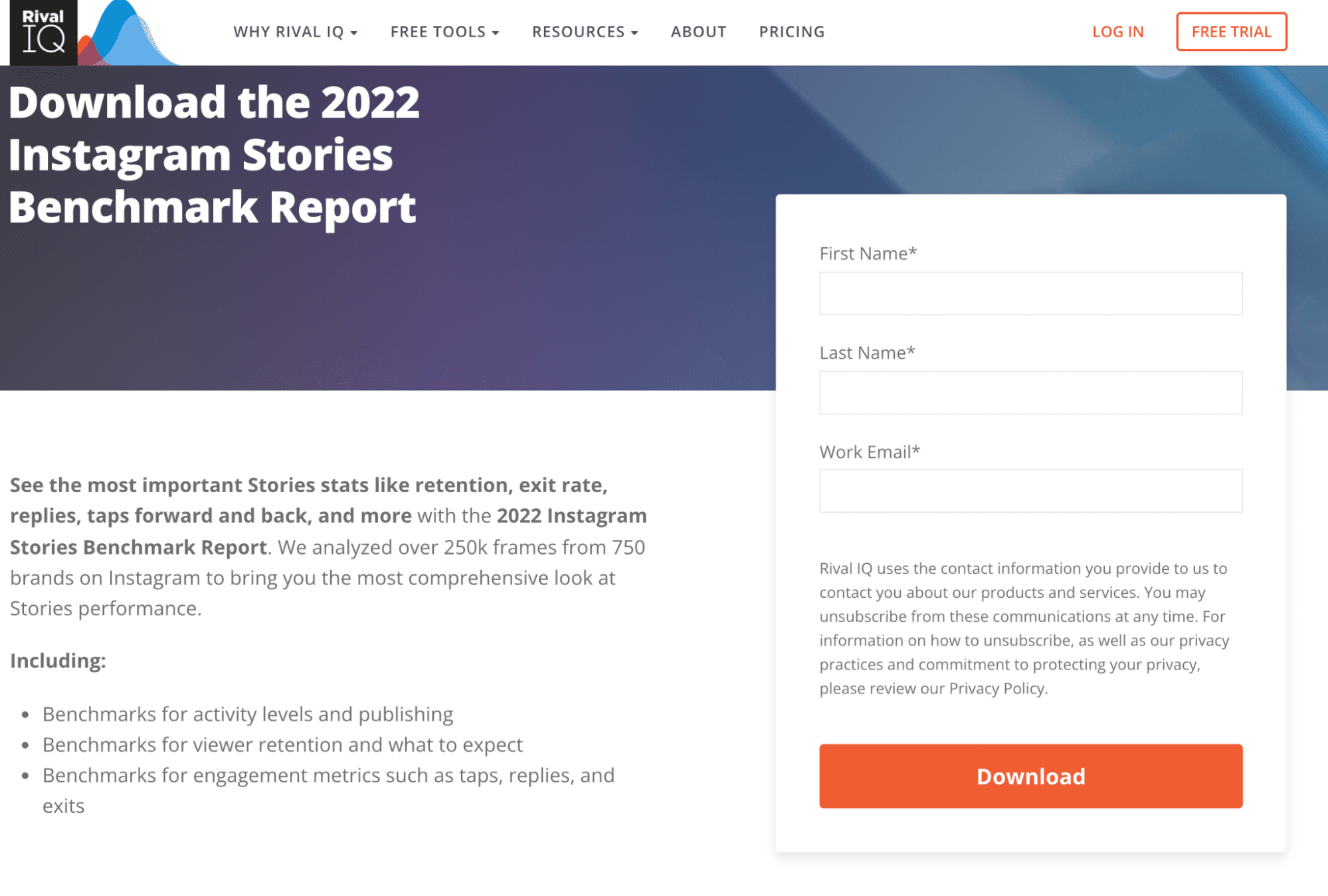
What works:
- The opt-in page promises an irresistible benefit (a free report) while not requiring too much more info on top of the basics (your name and work email).
- The bottom of the page lists well-known companies that trust Rival IQ (L’Oréal, JayBaer, and Alumni & Friends).
- The CTA copy is clear and actionable (“Download”).

Generate More Leads With Opt-In Pages
Opt-in pages are a great way to help you increase conversions and capture attention from potential leads. To make the most of your opt-in page, include a strong value proposition that offers something of immediate value, a lead form that’s simple to complete, and a clear call to action.
Remember that opt-in pages are never set-it-and-forget-it pages—you’ll need to work on your design and content regularly to make sure that you’re converting as many visitors as possible.
The best way to do this? Monitor your opt-in pages metrics and analyze the results to see what’s working and what could use some improvement. Better yet, let Smart Traffic do the work for you by automatically directing your visitors to a page variant where they’re more likely to convert. See how Unbounce helps you easily create and test new opt-in page designs to boost conversions.
Source link


