While the rest of the world immerses in parades, food, music, dancing, and drinking to celebrate St. Patrick’s Day, email marketers busy themselves with crafting the most compelling and pixel-perfect St. Patrick’s Day email marketing campaigns to wow their subscribers. And well, why shouldn’t they? In 2021 alone, St. Patrick’s day sales touched approximately $5.1 billion in the U.S., a number that is, in all likelihood, going to rise further this year. Anyone would want a piece of that pie, right?
If you want to jump in on that bandwagon, you’re at just the right place. Here, we’ve rounded up the choicest of 22 St. Patrick’s email inspirations, featuring the best in the business to fill you with plenty of inspiration for your campaigns! Read on and make the luck of the Irish all yours.
FlashingBlinkyLights.com
Subject Line: Ready, Set, GLOW Green!

Now, every festival out there is synonymous with a particular color- Valentine’s Day and red, Halloween and orange, Christmas and red and green, and the like. For St. Patrick’s Day, that color is green. Hence, the smartest course of action is to make green as prominent as possible in your email design- just as FlashingBlinkyLights.com has done over here.
The minute you open this email, your mind can’t help but connect it to St. Patrick’s day, without even reading the content! The products have been displayed with the help of a photo grid which makes for easy viewing. A good touch here is the inclusion of the customer review; more often than not, a positive testimonial nudges a reader towards buying from you.
FeatSocks.com
Subject Line: Get 25% off the sale O’ the spring, while stock lasts…

Having a good and high-quality image in the hero section of your email works wonders in capturing the reader’s imagination. FeatSocks.com has done precisely that over here. What’s particularly remarkable over here is how they have carefully curated their products to contrast nicely with the soft shade used in the email background. Further, the use of serif fonts renders an attractive retro look to the overall layout.
JibJab
Subject Line: Wish them a Happy St. Patrick’s Day!

A surefire way of making your email design engaging is by including animated GIFs in it. And if you further want to elevate its appeal, add a touch of humor. This email from JibJab is a perfect illustration of that. While the neat, clutter-free layout keeps your eyes rooted to the email, the hilarious GIFs bring a smile to your face and make you want to take action.
Decor Planet
Subject Line: St Patrick’s Day Sale Only 12 Hours Left Shop These Brands & More, and Save Extra 15% At Checkout or 20% On Select Brands
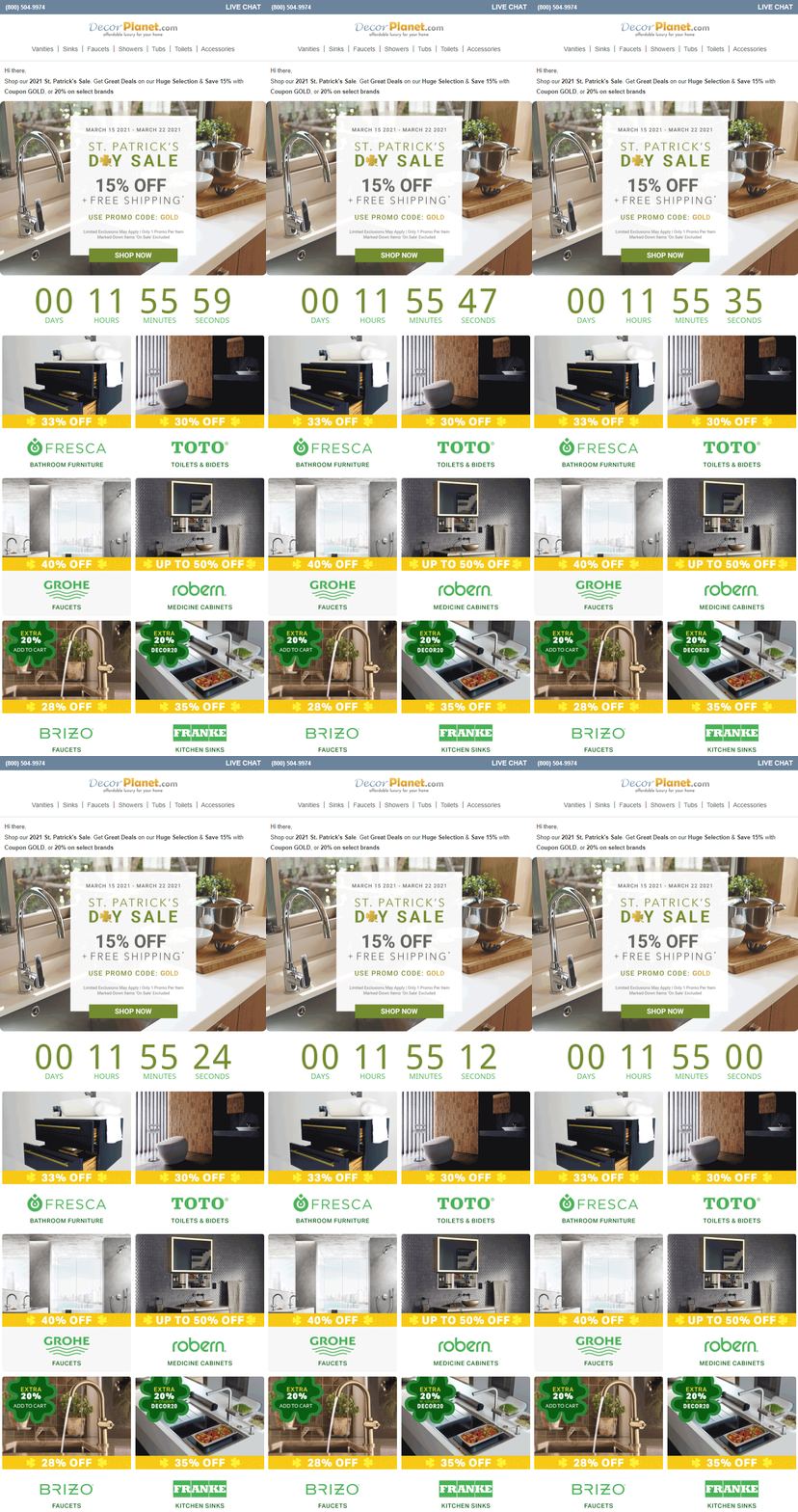
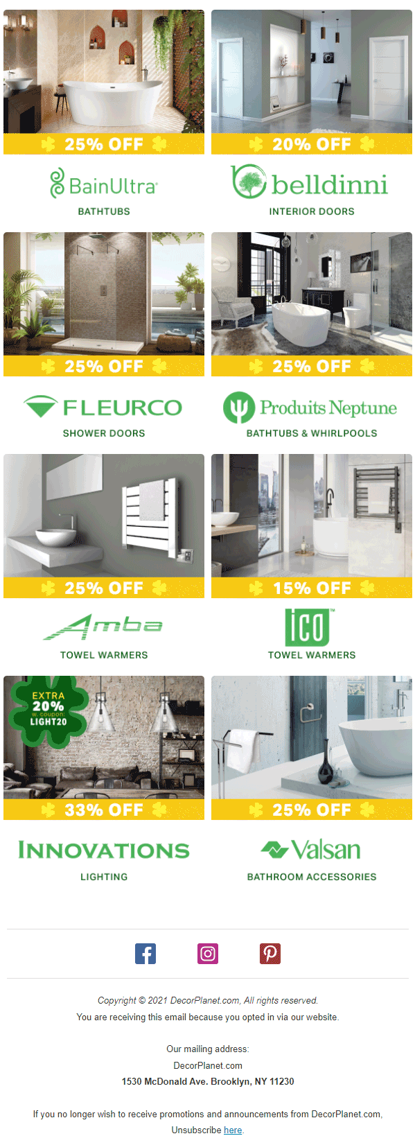
Remember, you’re not the only one from whom your customers will receive mail on St. Patrick’s. Their inboxes will get flooded from a lot of directions. So, you’ll have to get pretty creative to cut through the noise. One excellent tactic is to create a sense of urgency by adding a ticking clock, as Decor Planet has done over here. Two things stand out for us in this design:
- They’ve disclosed the promo code in the hero image itself, which is a great ploy to catch the reader’s attention.
- The placement of the ticking clock above the fold.
The subject line seems too long, though.
Displate.com
Subject Line: Missed out on our Sale?

When you’re announcing a discount, using bold typography is a great means of calling your subscribers’ attention to it. The design folks at Displate.com understand that. To further incentivize the reader, they’ve also showcased their top-selling products in this email, arranging the images in a simple photo album grid.
5 Star Nutrition
Subject Line: Final Hours 5 Star Nutrition’s St. Patricks Day Sale

It is always a good practice to make your products the most defining feature of your email’s hero section, something 5 Star Nutrition has nailed to perfection over here. While they have made ample use of the color green to drive the St. Patrick’s emotion home, they have also used a black background to ensure that both the white and green text portions contrast properly. Also, love the clever bit of wordplay in the header copy.
Lentiamo IE
Subject Line: Final St Patricks Day Sale! 25% Off
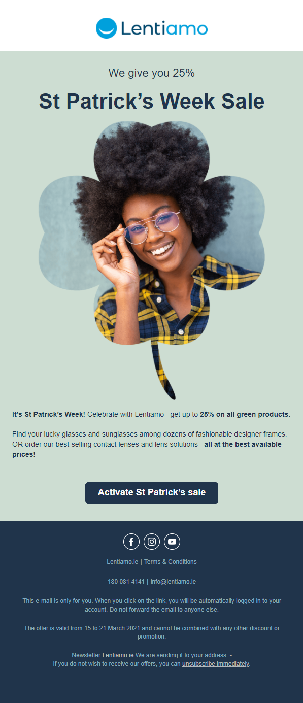
Nothing screams St. Patrick’s Day quite like placing your primary image within a clover frame, does it? This simple yet creative design maneuver is enough to make their subscribers take stock of this email. Instead of garbing the typical green, however, Lentiamo has chosen to stick to its original brand colors. Coincidentally, blue also happens to be one of the shades associated with St. Patrick’s.
HOUNDSBAY
Subject Line: This is going, going, gone… 20% OFF
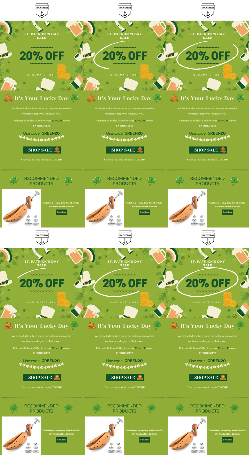

Want to make your emails fun and visually appealing? Use 2D illustrations! Besides beefing up the aesthetic value of the email, illustrations are an incredibly effective storytelling medium too. This makes them an indispensable part of every email designer’s toolkit, not least of those working at HOUNDSBAY. Additionally, really appreciate how they have used animation to encircle the discount margin.
TUSHY
Subject Line: 15% off with code LUCKY ends tonight!
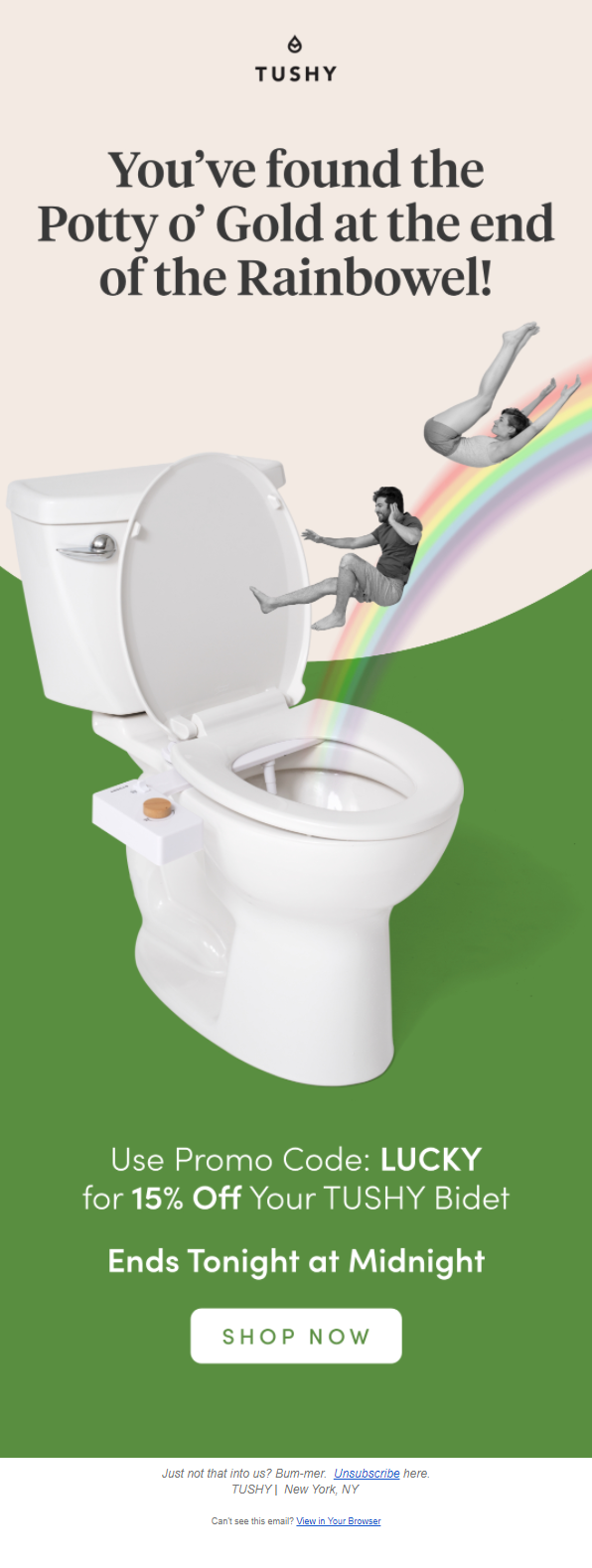
This is perhaps the funniest entry in this lineup. Not many bidet manufacturing companies would attempt connecting their products with St. Patrick’s Day, but well, the creative team at TUSHY is cut from a different cloth altogether. A witty copy, hilarious visuals, and an extremely minimalistic layout- what’s not to love about this St. Patrick’s Day email?
Miracle Noodle
Subject Line: YES! Meet the best keto pasta ever

Figuring out how to connect your brand offerings with the occasion at hand can be fairly challenging, but if you can do it as ingeniously as Miracle Noodle over here, you’ll definitely grab your customers’ eyeballs. The layout is clutter-free, easy to navigate, and has prominent CTAs (call-to-action). Besides, it’s really tough to ignore a bowl of scrumptious-looking fettuccine, isn’t it?
Email Uplers
Subject Line: Can you help Benjamin Banks catch the Leprechaun?
There’s perhaps no better way of securing your audience’s engagement than by inviting them to interact with your emails. That’s exactly how we, at Email Uplers, decided to go about our St. Patrick’s campaign last year- asking our participants to participate in an interactive game!
In recent years, gamification has grown to become one of the most exciting email design trends out there, and we couldn’t resist the urge to implement it either. The objective of the game was simple- using mouse clicks, the players had to catch the Leprechaun appearing intermittently on their screens.
SQUISH Candy
Subject Line: Lucky as a leprechaun!

Animated GIFs in the email’s hero section never fail to be eye-grabbing. This email from SQUISH Candy holds testimony to that. While the bold typography over here communicates the message, the use of a single-column layout makes the email incredibly easy to consume. Also, notice how the visual appeal of their products (the candies in the email) has been enhanced by adding shadows.
Austin and Kat
Subject Line: 20% off, only 8 hours left

This playful layout, replete with a bevy of cute illustrations from Austin and Kat, is not just downright adorable but also smartly reinforces their brand tonality. Even though the color of the font is similar to that of the background, the thickness of the typography ensures the content is extremely readable.
GLO Science Teeth Whitening
Subject Line: Go Green with GLO

What’s better than displaying your products’ images in the email’s header image? Using a picture where it’s in action! With their hero image, the team at GLO Science helps you visualize how your precious smile can be further enriched by using their product. The design generously uses white spaces, which provides visual relief. The section at the bottom accompanying the CTA button uses animation to echo various positive reviews.
Eco Vessel
Subject Line: Celebrate St. Patrick’s Day with a delicious cocktail!

St. Patrick’s Day is incomplete without a good drink or two. Eco Vessel capitalizes on this sentiment over here. This tutorial email uses a combination of a gorgeous background, simple illustrations, and unfussy typography to share the recipe of St. Patrick’s Day special cocktail with its readers.
Bell Socks
Subject Line: Happy St. Patrick’s Day!

Adding geometric shapes to your email design doesn’t just make your email easy on the eyes but also reduces the cognitive load of the reader. Both these merits are pretty evident in this St. Patrick’s Day email from K. Bell Socks. The smart use of white space in the “Featured Styles” segment eliminates visual clutter, making the email that much more pleasing to behold.
Angelic Bakehouse
Subject Line: Happy St. Patty’s Day

What really stands out in this Angelic Bakehouse email is the design framework they have opted for to showcase their products. Presented in small circles, they’re accompanied by solid and striped green strokes, which both convey the St. Patrick’s theme and enhance the visual aesthetic of the email by leaps and bounds.
TreStique
Subject Line: Open for a Free Gift

Emulating your brand identity in your email design is a challenge many struggle with; not the marketing team at TreStique. This chic layout from TreStique comprises stylish smear strokes, a striking photomontage in the hero section, and background and foreground colors that contrast beautifully.
Christy
Subject Line: Go Green For St. Patrick’s Day

The high quality, incredibly aesthetic header image isn’t the only commendable thing in this email design; the content presentation is worth noting too. Arranged in a zigzag layout, it allows the readers to scan and consume the information in an efficient manner.
Simmi Shoes
Subject Line: it’s your lucky day…

Heavy on visuals, the most distinctive aspect of this St. Patrick’s Day email is undoubtedly the elegant collage that serves as its header image. While interacting with emails from the fashion and lifestyle industry, people typically pay more attention to the visuals than the copy. So, using top-notch images is your best bet to win them over, just like Simmi Shoes has done over here. Anyone would be left in awe of that breathtaking collection, wouldn’t they?
MatchaBar, Inc.
Subject Line: Celebrate with the best green


From the lovely animated GIF to the visually arresting typography to the harmonious medley of colors- MatchaBar hasn’t put a foot wrong in the design of this email. Cashing in on the St. Patrick’s spirit, this email shares two exquisite cocktail recipes. The images of the finished products act as a good incentive to try these out.
BruMate
Subject Line: St. Patrick’s Day Picks are here
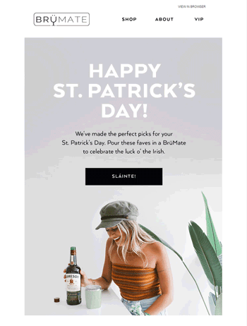
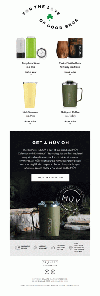
There’s something incredibly calming about the header image background in this BruMate email. And the smiling girl and the plant as foreground elements perfectly complement the mood it conjures. Another thing we like about this design is how they have used negative space instead of dividers to arrange the products. It makes the layout that much easier on the eyes.
Wrapping It Up
We’re sure that by now, your mind must be bubbling with a ton of ideas. So, what are you waiting for? Get cracking on your St. Patrick’s Day email marketing campaign and let it lead you to a never-ending pot of gold!

Source link


