

![]()
For all B2B and B2C targeting companies, the pricing page is significantly crucial. Your site visitors come to the website, skim through the main features, but still, something stops them from converting? Have you kept your product policy as transparent as possible? Are your prices extremely competitive as per the industry standards? But this is not enough for your target audience to flock your way. Most businesses use this approach, but they miss out on one very significant aspect of visitor conversion – modifying the pricing pages.
Sure, many people take up services by the features, and once they like all the features, then only they move to the pricing pages. But if the landing page turns out to be a nightmare, you may never hear from that particular visitor again. So, the pricing page is definitely where you strengthen your relationship with a visitor and convert them to a customer. Even if your prices are justified, simply a lousy pricing page design can result in a lost lead.
10 Principles for Creating Effective Pricing Pages
Let’s get started to understand the ten principles of creating effective pricing pages.
1. Simplicity is the key
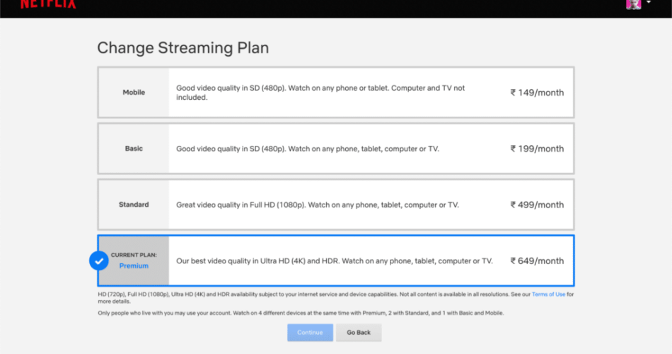
Too many visuals and a lot of words can distract your audience from the real deal. People tend to get lost in excessive information, and it holds true for pricing pages too. Most visitors only skim, compare, and choose! By mentioning your prices transparently, you also inculcate trust in your to-be customers.
For example, consider this pricing page from Netflix India. Also, note how they add a minimal personality into the copy and design.
 Source: Netflix India
One glance, and you can easily understand the different types of plans available, their benefits, and the price you need to pay. Such simple means of conveying information does not overwhelm the clients, and they quickly process the information to make a decision. So, keep a basic background, lesser colours, fewer texts – can it get any simpler?
2. Keep the expensive plans first
Less plans, more visuals, low word count. This is definitely the best approach for pricing page design, but the placement of plans also matters. Research shows that most people read all the features and prices mentioned on top, irrespective of the placement. However, when the expensive plans are placed first, or even highlighted, visitors are more prone to focusing on it and eventually subscribing. Even if you don’t want to keep the expensive plans on top, highlight the plan you want your clients to take up.
Mailchimp clearly states its USP on top and follows it with their plans in descending order of price, and surely, that seems to be working wonders for the company,
 Source: MailChimp
3. Mention who the plan is for
You know the best who your services are meant for, and who can make the most out of it. Do not hesitate to mention it upfront on the pricing page. Instead, it adds a relatability factor for the visitors, who can find a curated plan just for their needs. By offering multiple plans and helping customers choose the best one for them, you start a dialogue that results in conversion.
It’s commendable how Shopify clearly mentions the target for each of its plans without any ambiguity. It is also a good idea to always highlight a recommended plan.
 Source: Shopify
4. Add testimonials to the pricing page
Trust building is an essential component of designing the pricing page. If you have been offering your services for a while, then adding social proof with testimonials can also drive conversions. You want your prospective customers to believe that if other people like them are recommending something, it must be trustworthy. These testimonials can also go on to express what value your services bring.
Pipedrive boasts a customer base of over 75,000 sales teams across the globe. With testimonials added below its pricing chart, the company adds credibility to its claims.
Pipedrive’s design is a textbook example as it leverages almost all the principles of creating effective pricing pages to deliver an intuitive experience to the user.
 Source: Pipedrive
5. Show them what each plan lacks
Sounds different? Well, it’s common to mention what every package comes with, but simply altering the presentation can make a huge difference. Show your prospective customers what the basic plans lack, but the premium plans come with. Addressing pain points first helps customers realize what they’ve been missing out on, by not taking the premium package that you offer.
Check out the pricing page of Asana, where they draw up a chart to show how their basic plan offers less than 50% of what the enterprise version does.
 Source: Asana
6. Less is more
When talking about simplicity, it is also important to limit your pricing plans to fewer options. This way, the plans are easy to comprehend, and the visitors find adequate features distributed well, across the plans. Undoubtedly, the less you give your audience to think about, the better your conversion rate can get.
 Source: Canva
7. Add customer support chatbot
What if your customer has only one last question before purchasing a service? They will either go ahead without an answer or call it a deal-breaker! Not when you have a customer support chatbot live on the pricing page. 73% of people believe that live chat is the most satisfactory way of customer support. So with an outstanding design, a chatbot can really help grow your business.
Businesses like HubSpot also have an active chatbot on their pricing page.
 Source: HubSpot
8. Emphasize security
With each passing day, the conversation around digital security is increasing. By adding clauses of security and privacy to your pricing page, you can showcase your zeal to protect their data, and thus, build trust.
Take a look at how frequently Highrise uses these buzzwords.

9. Devalue money
By making the currency signs small, you can psychologically entice customers into believing that they’re spending only a small amount. This devaluation of money can help B2B and B2C service sellers to strategize and grow their conversion rates.
 Source: Pipedrive
Many businesses also leverage the psychological manipulation of adding the number ‘9’ to the prices. It makes the price look lesser by a dollar, and customers think they’re getting the best value deal at a lower price. You can also add a quick toolbar to convert currencies for ease of access.
10. Incentivize annual payments
When you get visitors to sign up for annual plans, it guarantees a good cash flow. However, try not to be very aggressive in your plans. Add incentives to annual payments, such as an additional free trial period, greater discounts on annual subscriptions, etc.
Unbounce mentions three plans and subtly adds a 10% discount on the yearly plans. Even the $10 dip in the monthly rates can be very lucrative for interested people.
 Source: UnbounceConclusion
To sum up, your pricing page can make a significant difference in your website’s conversion rates, depending on its appeal. You can end the page by telling your visitors what happens next when they subscribe to your plans. Also, try to include action buttons and information, wherever possible. But the most important part is to never stop testing. No two enterprises can succeed with the same formula. So apply a few changes and compare the results – A/B testing should be your all-time companion.
These timeless principles for creating effective pricing pages can help you get started in the right direction, but do not be afraid of experimenting with your niche and target audience. Begin with these guidelines and principles to drive better conversion from your pricing page.
The post 10 Principles for Creating Effective Pricing Pages appeared first on Digital Uncovered.
Source link